About the project
A multi-channel experience for a social campaign.
Antibiotics resistance is a serious threat to modern society. Once considered the miracle drug that extended life expectancy, antibiotics today are abused by agriculture, loosely prescribed by practitioners and highly demanded by the general population. These practices has been creating stronger strands of bacteria faster than the pharmaceutical industry can keep up.
Any solution to the problem seems to be a long term investment, and some would need governmental intervention. This project tackles one face of the prism, educating an audience on the following:
1) When to take antibiotic and when not to take them;
2) What is antibiotics resistance and how it affects us;
3) How can we be part of the long term change.
2) What is antibiotics resistance and how it affects us;
3) How can we be part of the long term change.

Research — The Infection Phase
> Generative research:
Studying other health related social campaigns, reading reports on antibiotics resistance and watching doctor's interviews online was the first step. An alarming fact that surfaced was that Australia is one of the leading countries in prescription and use of antibiotics in the world, according to the "First Australian Report on Antimicrobial Use and Resistance in Human Health, 2016". This indicates such campaign is a relevant topic.
Studying other health related social campaigns, reading reports on antibiotics resistance and watching doctor's interviews online was the first step. An alarming fact that surfaced was that Australia is one of the leading countries in prescription and use of antibiotics in the world, according to the "First Australian Report on Antimicrobial Use and Resistance in Human Health, 2016". This indicates such campaign is a relevant topic.
I tested my findings through an online survey, choosing Typeform as my platform for their conversational language and engaging flow.
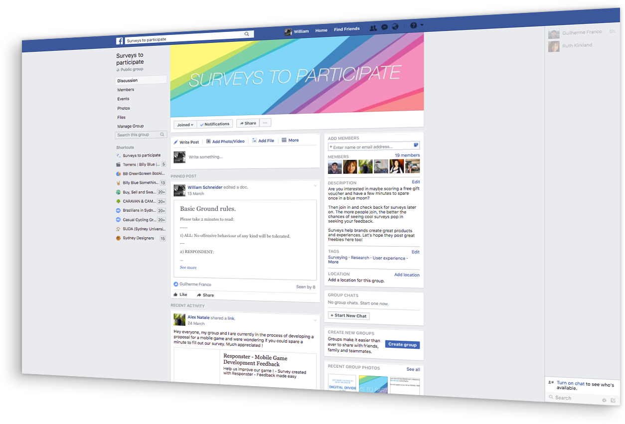
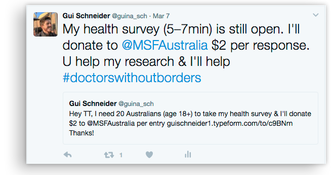

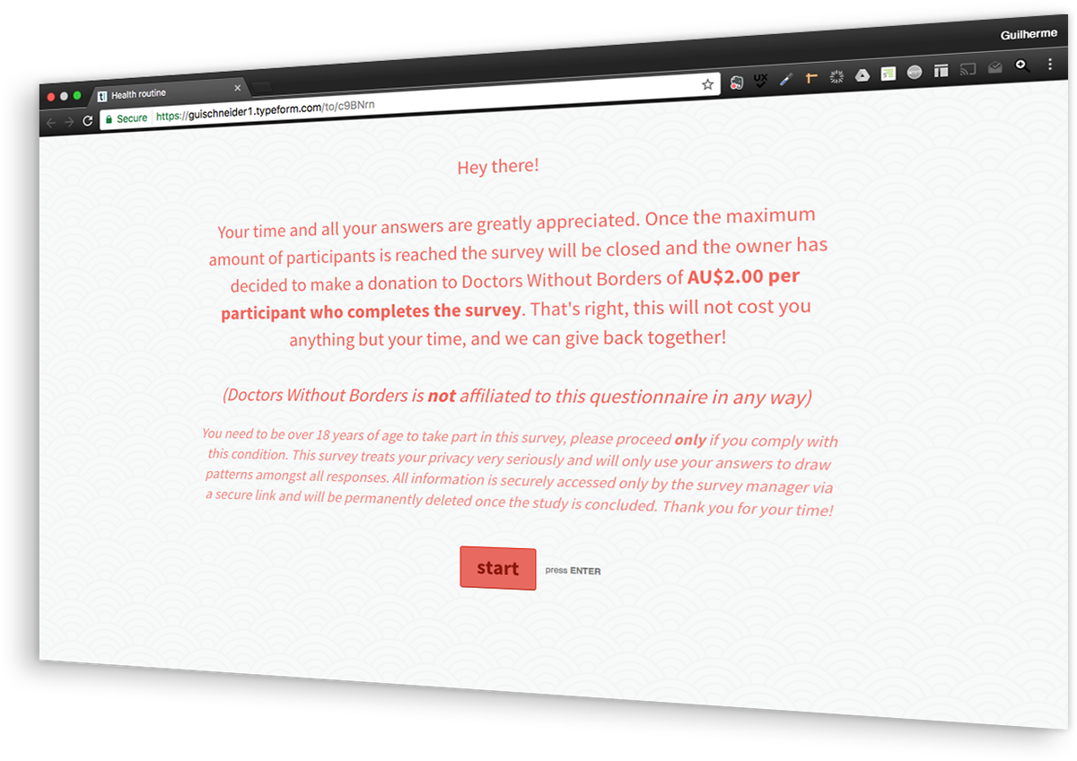
I shared the survey on a Twitter and Facebook, promoting it via targeted ads. As an incentive I offered to donate $2.00 to Doctors Without Borders for each participant who took the survey, for a health related emotional appeal.
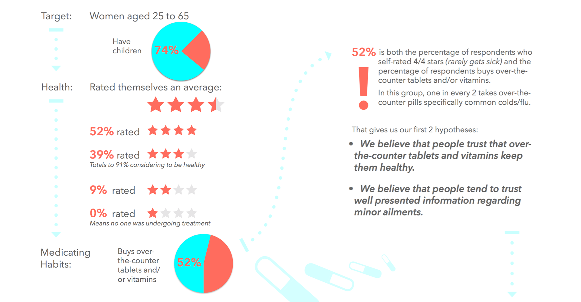
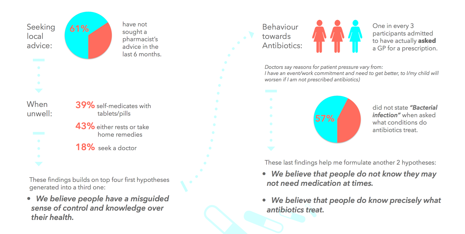
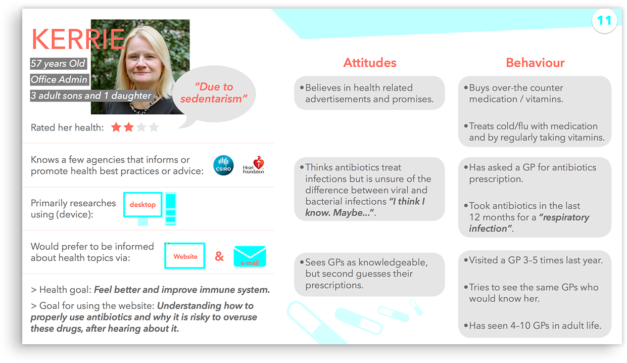
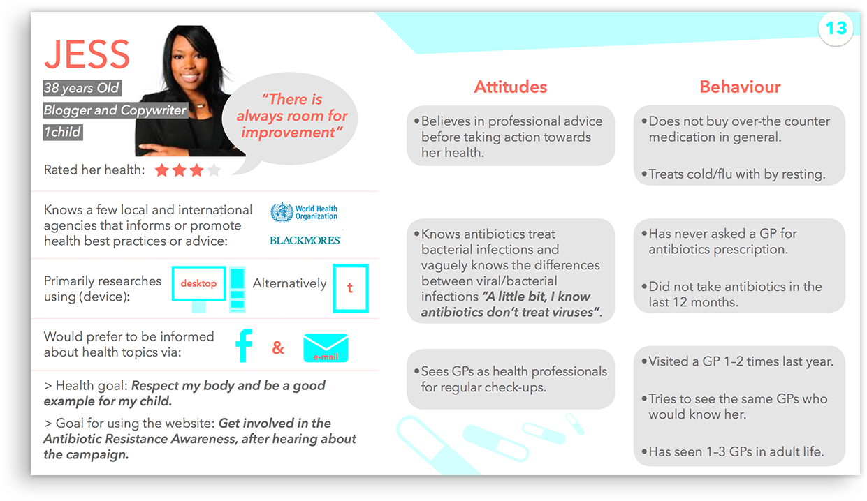
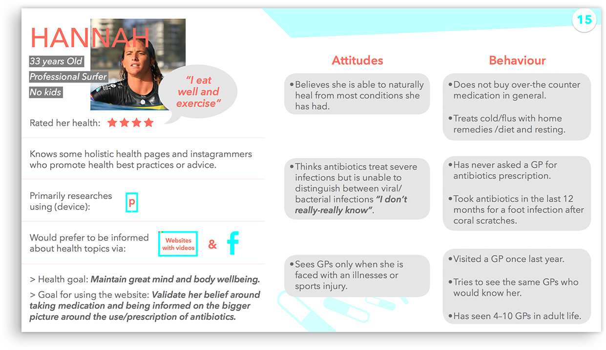
The responses to the quantitative and qualitative questions I asked allowed me to generate personas, and together with my inicial generative research on the topic, I developed some hypotheses to work with.
Personas

Competitors' Analysis
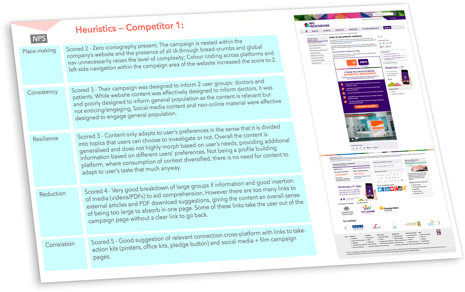
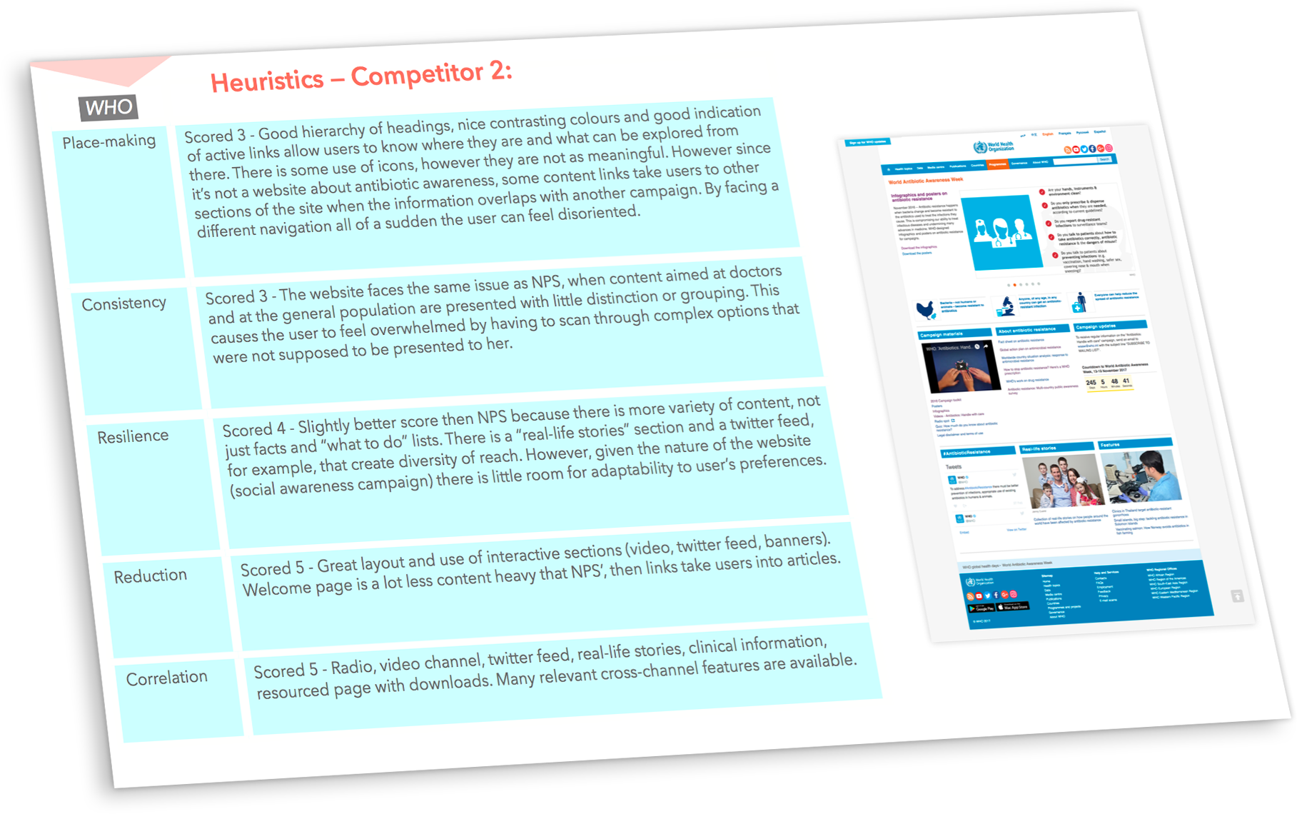
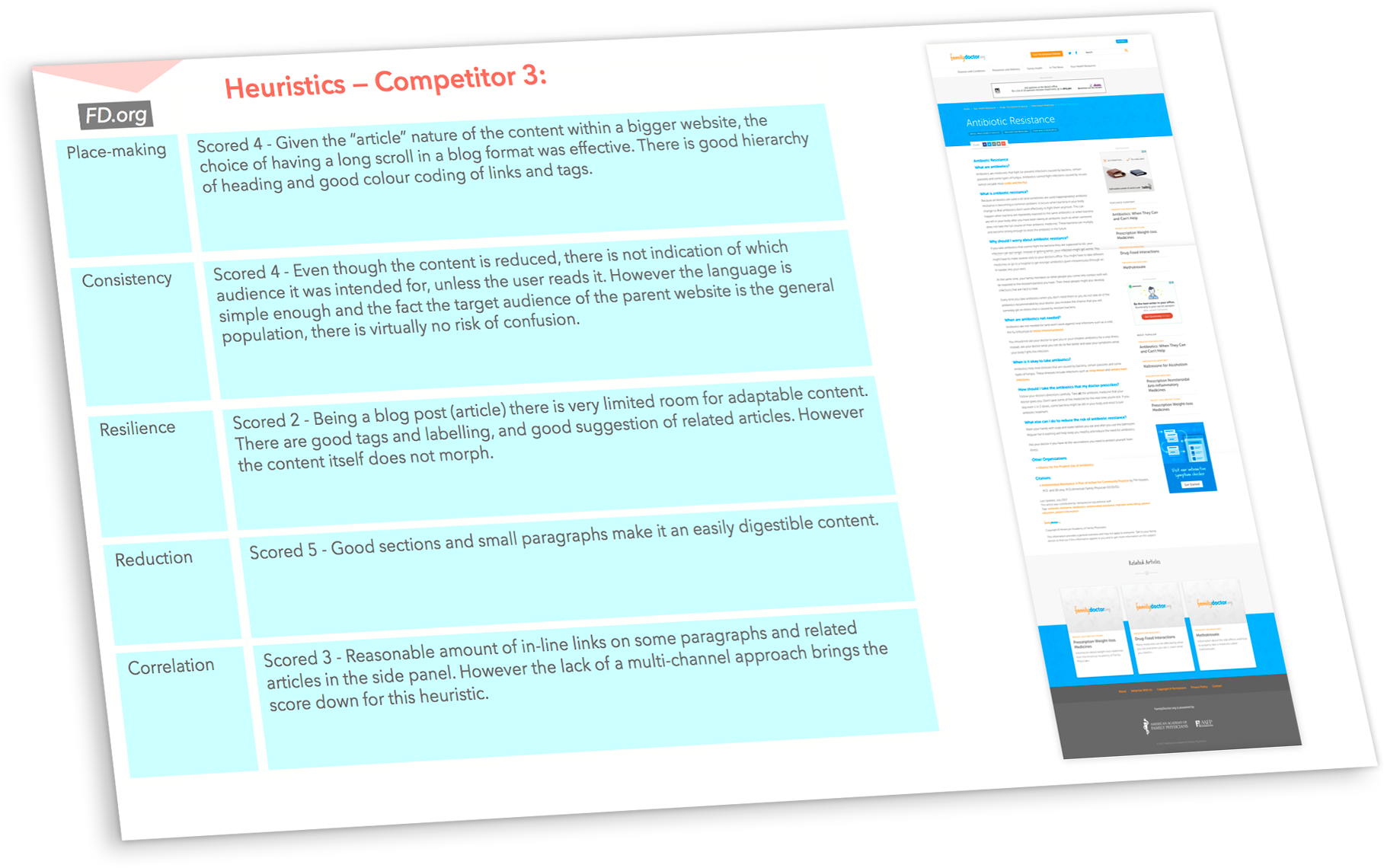
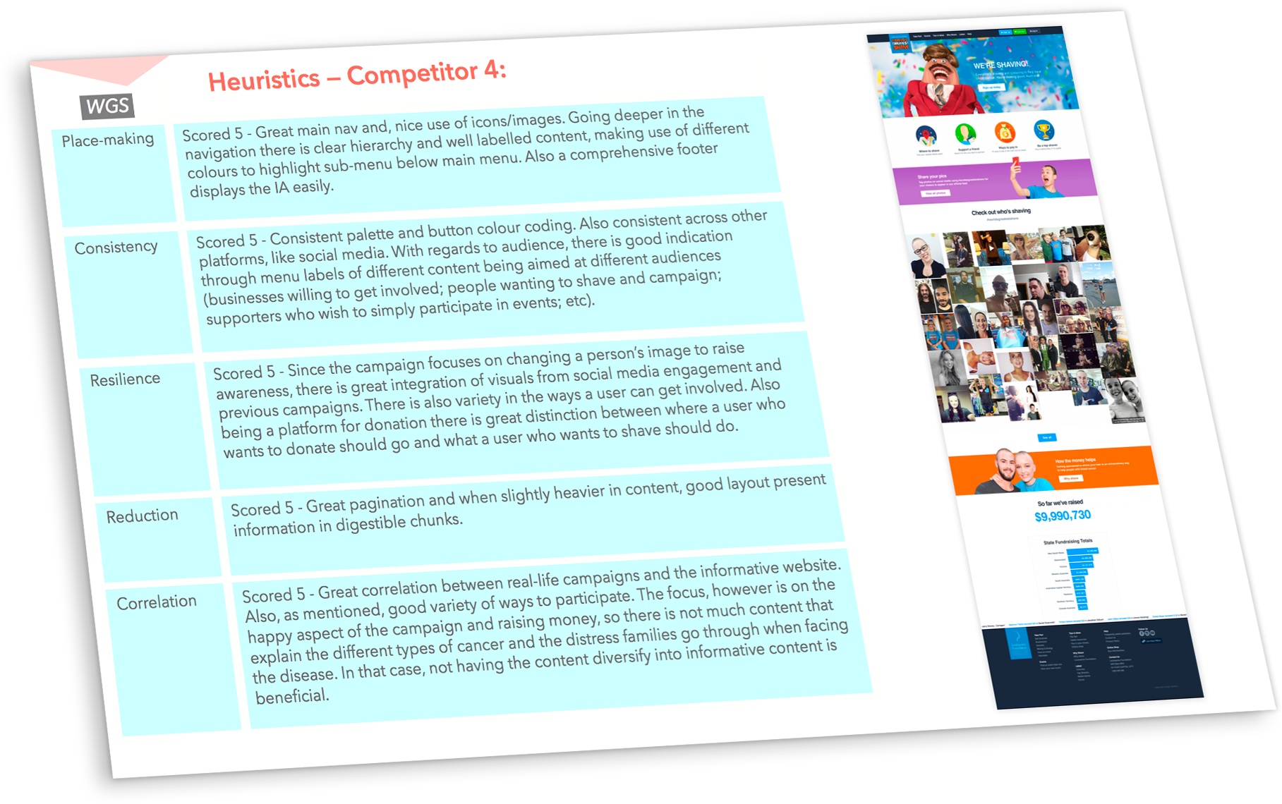
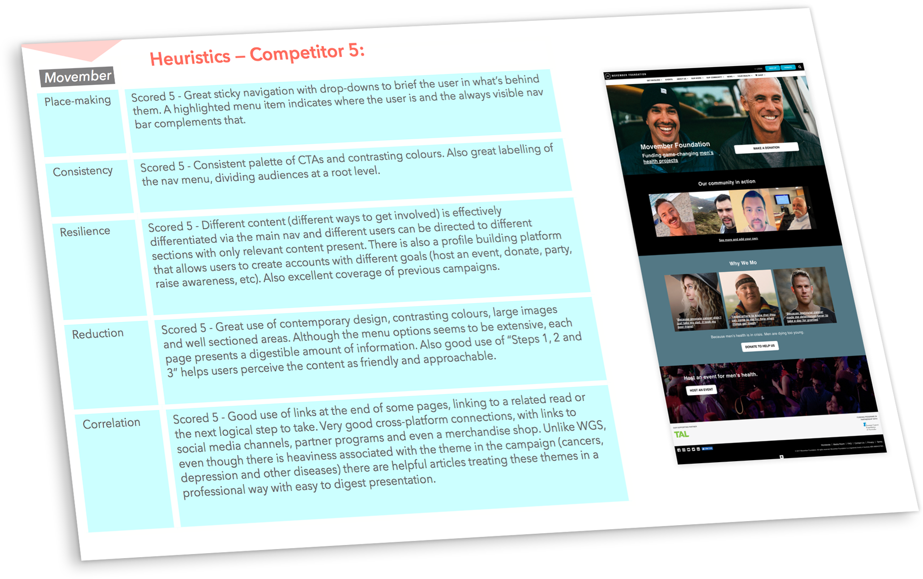
A heuristic evaluation on the websites of 5 health related social campaigns was then performed—three direct competitors campaigning about Antibiotics Resistance (NPS MedicineWise, World Heath Organisation and FamilyDoctor.org) and two indirect competitors with successful social campaigns (World's Greatest Shave and Movember).
Information Architecture
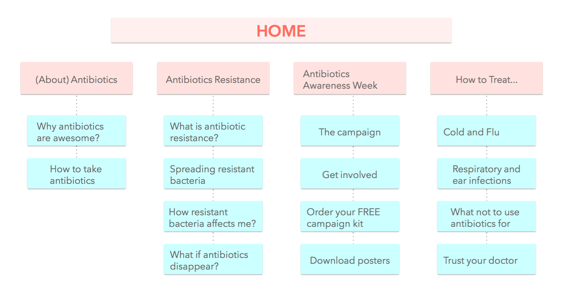
The final stage of the "Infection Phase" was to structure an information architecture for the content to be tested, which turned out to validate some hypotheses even before the development phase began.
An open card sorting exercise validated a lack of knowledge over antibiotics because, for example, many users placed the card "treating cold and flu" away from "what not to use antibiotics for". On the other hand, cards related to how to take part in the campaign were successfully grouped together.
I followed that up with a TreeJack exercise online via Optimal Workshop to validate if users would find the correct information in the suggested structure if they had tasks to complete.
The high success rate in this exercise allowed me to lock the first IA to build wireframes for the next phase of the project.
Multi-channel experiences — The Incubation Phase
Based on my competitor's evaluation I listed all potential channels for this campaign. To illustrate better how channels intersect I developed an interactive diagram in Axure RP, which can be accessed through this link (optimal on desktops), or seen in the image below.
In the interactive version, hovering over each channel on the lefthand side diagram will highlight which channels directly connect to it. The table on its right takes a step further and depicts indirect connections between channels.
CEJs and User Flows
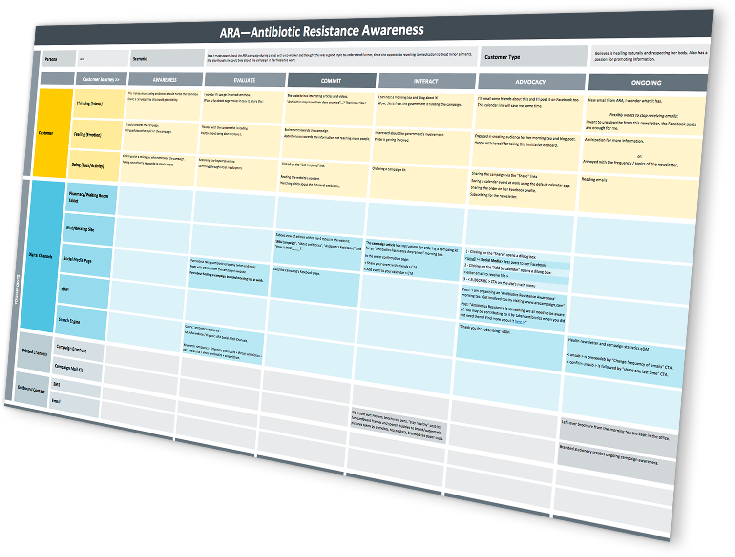
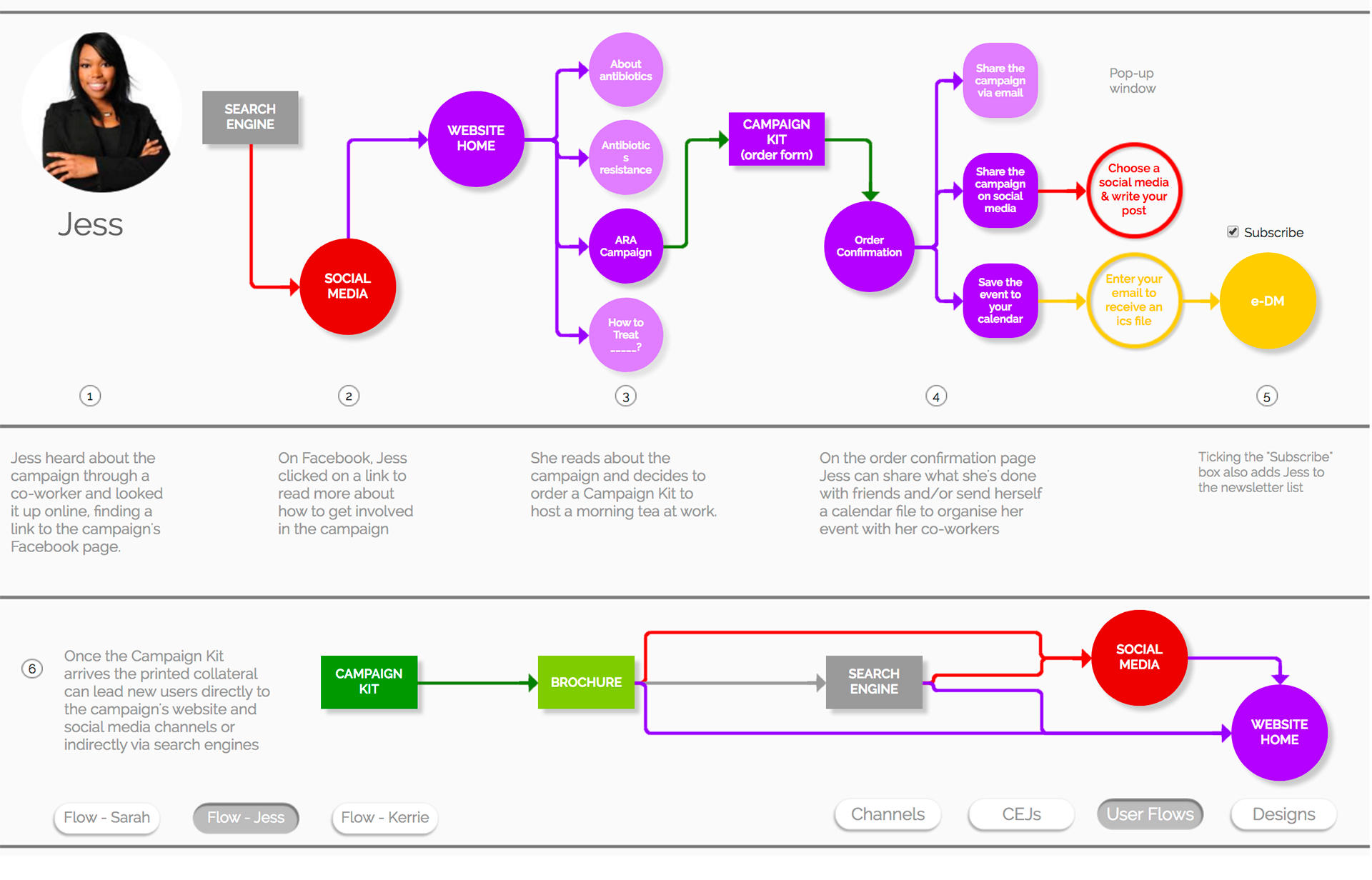
Building upon my personas' goals for engaging with the campaign I also mapped Customer Experience Journeys (CEJs) and user flows in this interactive Axure prototype.
These flows take users through multiple touch-points over various channels, from print to digital, and will form the base for my user testing sessions at a later stage.
Design
A mobile first approach was taken for the website channel, and due to the scope of the project it was the only viewport size designed and prototyped for the testing phase.
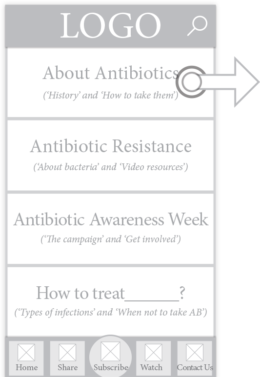
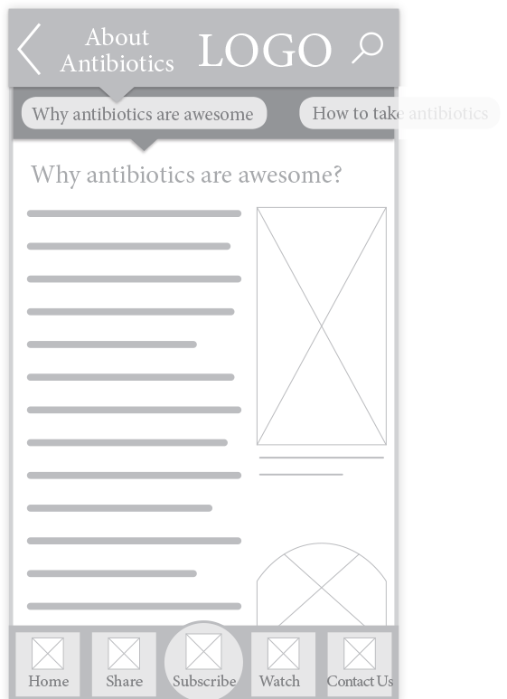
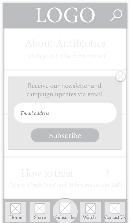
Based on the information architecture presented above, first iteration of the website that was tested organised articled within four categories. A global navigation enabled users to share content, subscribe to newsletters, jump to the videos section of the campaign (external link to YouTube channel through an in-app browser) and to quickly access "Contact Us" information.
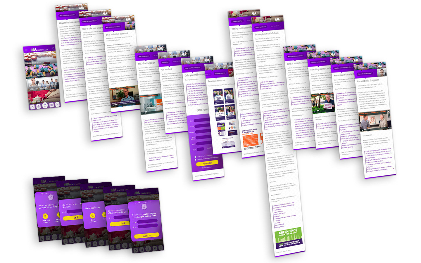
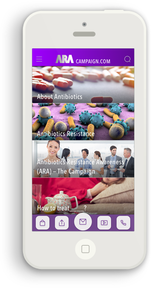
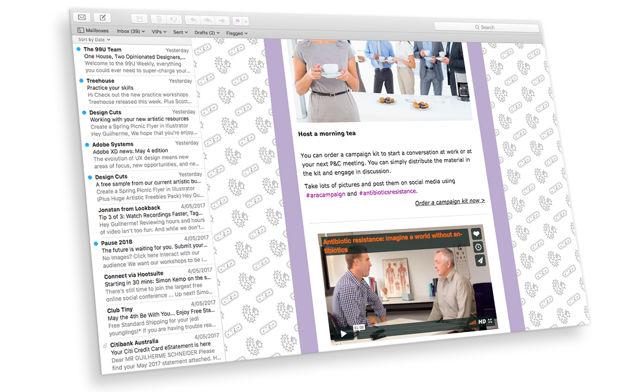
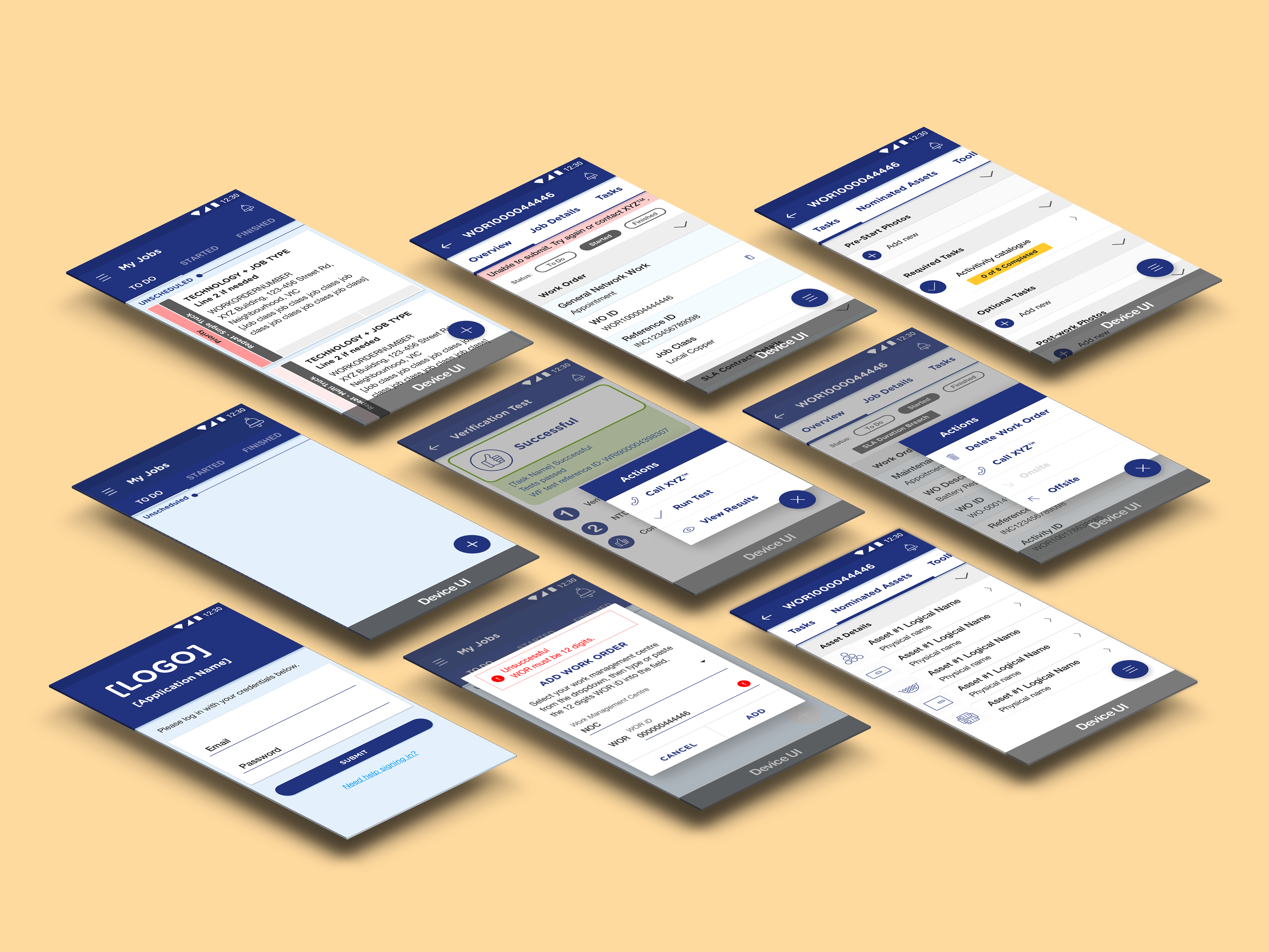
Mobile designs and eDM campaign.
Prototyping
Principle App was my tool of choice to create these prototypes for the testing sessions. It builds engaging animations and transitions by default, provided there is great care with layer naming and housekeeping. It also offers a simple interface to work with and great integration with Sketch App, which I used to design the assets.
See the walk through each prototype in these videos I keep in my Dropbox account: mobile website and in-pharmacy tablet.
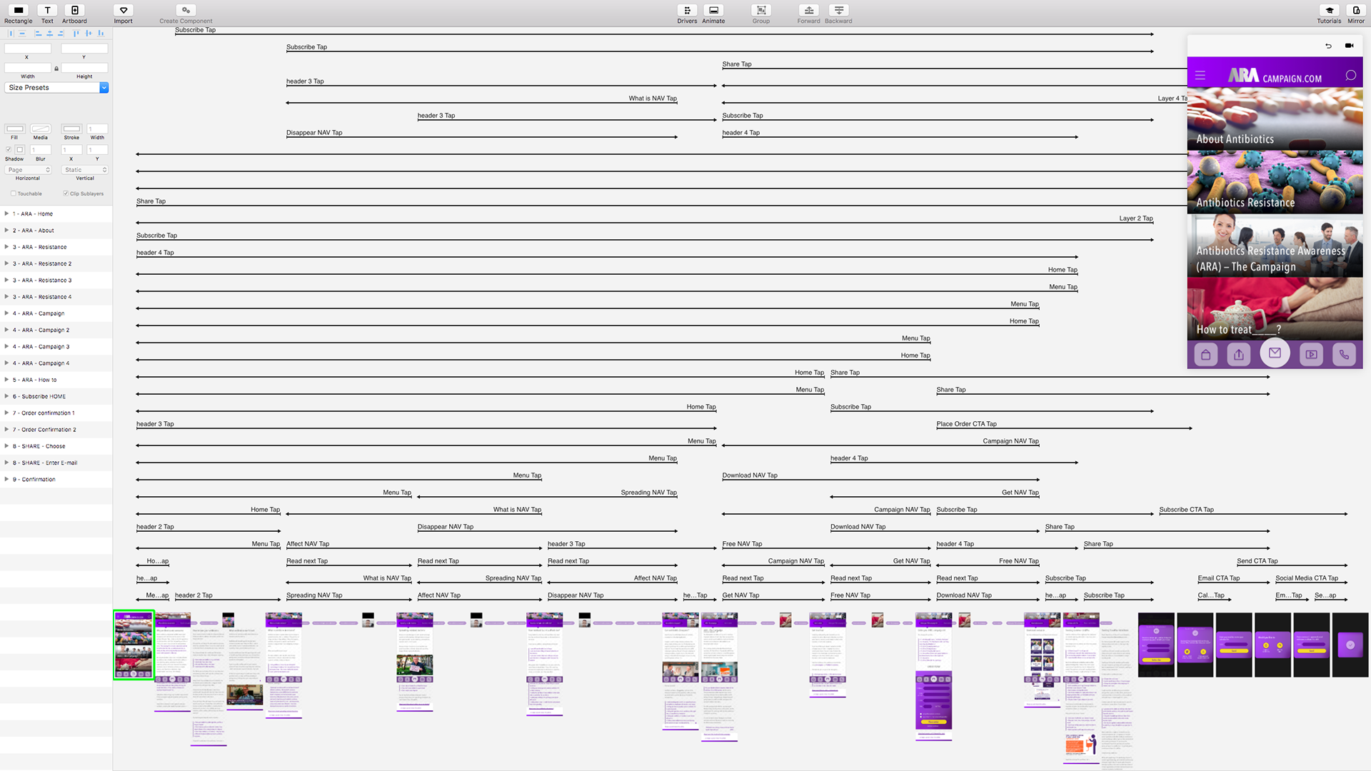

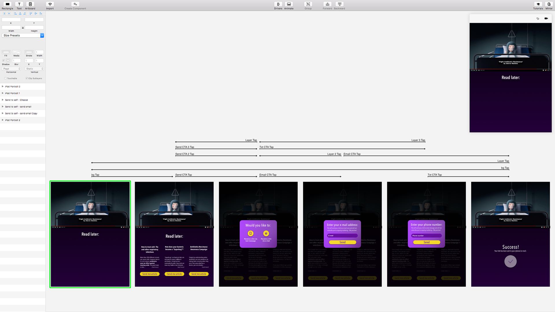
User Tests — The Immunisation Phase
My scrip contained the tasks necessary to go through the user flows outlined previously, tying back to the original goals each persona had for engaging with the campaign.

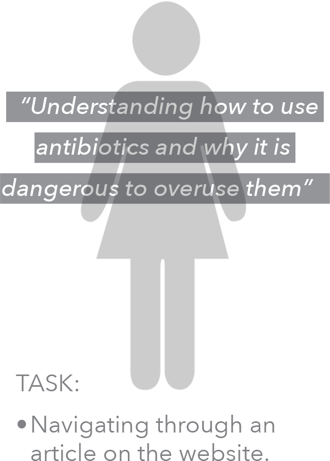
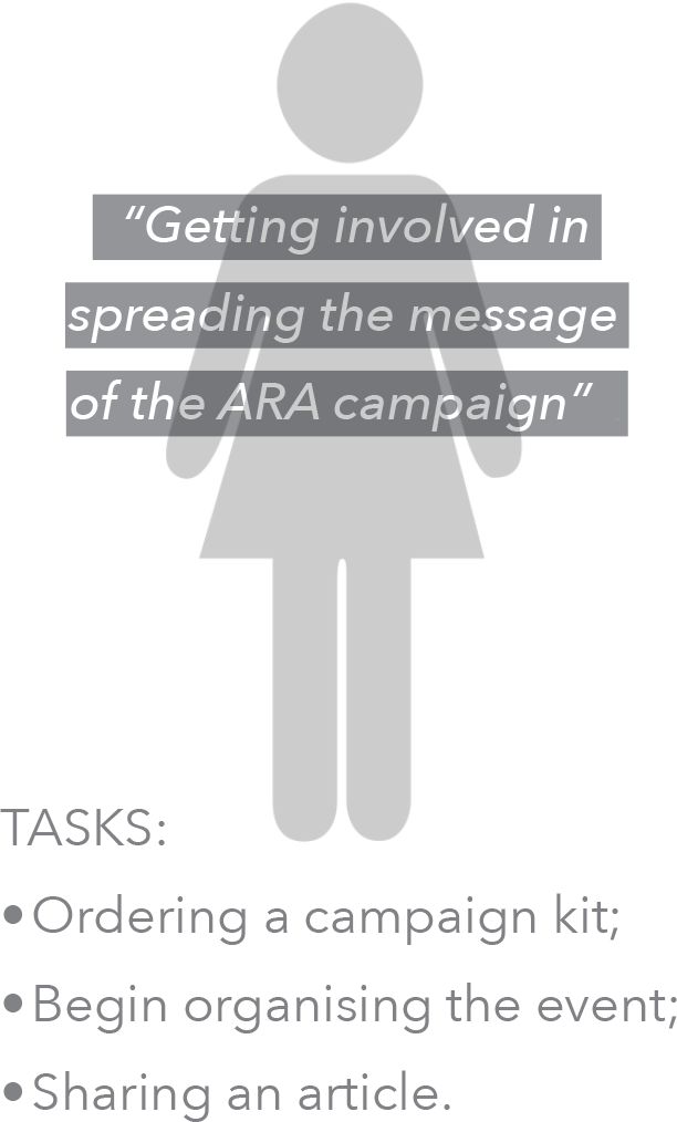
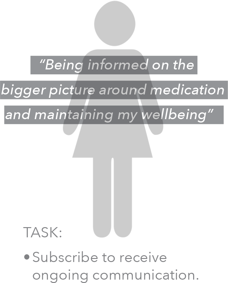
I also documented the flows within each task visually and printed on A3 size paper to facilitate observation during the test sessions, offering space to annotate behaviour.
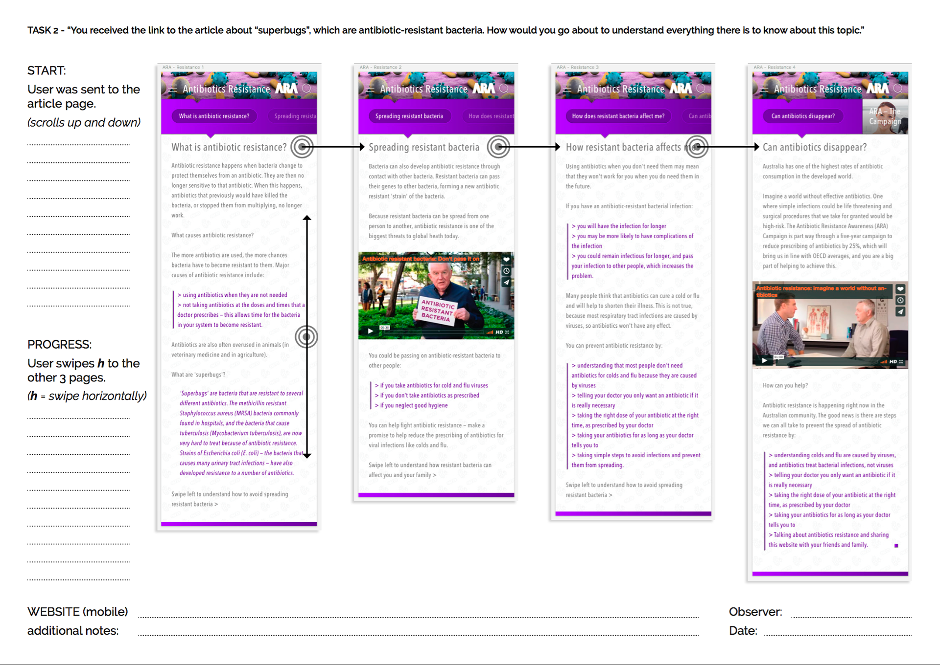
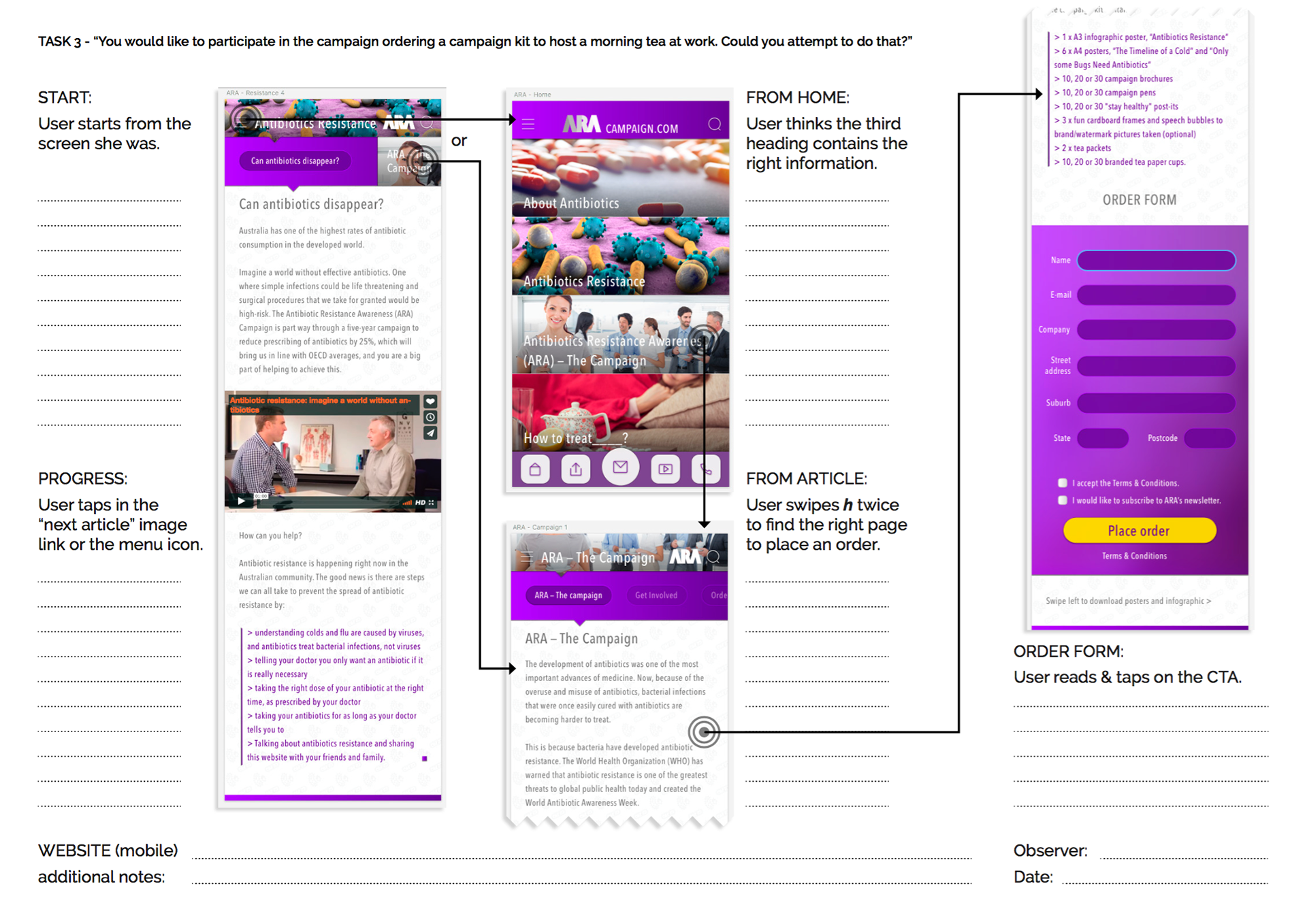

Each test session video is available to be watched via this link.
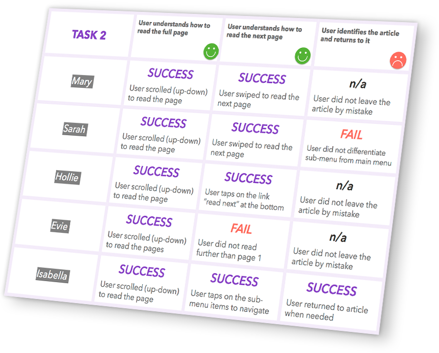
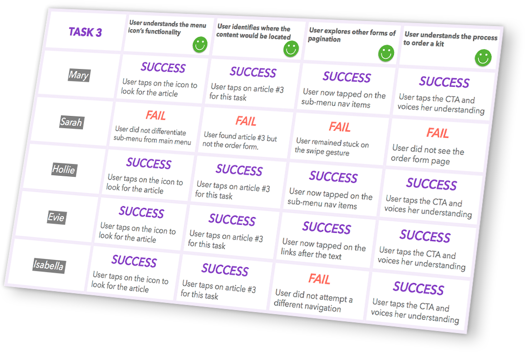
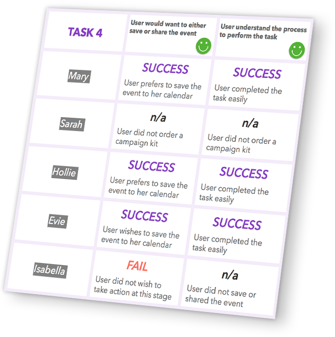
After documenting each session, I analysed the results and provided my findings. The problems identified involved privacy concerns when sharing the article from the in-pharmacy tablet, some confusion with the typographic styling of bullet-points resembling links and with the iconography and overall design of the bottom navigation being weak.
Would you like to discuss this project?
Thank you! I'll be in touch soon.
