As a HCD service provider, I prioritise the protection of my intellectual property and the corporate ownership of the projects I work on. The designs and processes showcased on this page serve solely as demonstrations of my skillset, while the ownership and rights of these designs and all capabilities described belong to Harlequin International Group. Unauthorised distribution or reproduction of the content and ideas on this page without explicit consent is prohibited.
By continuing to read you acknowledge and agree to adhere to the conditions outlined in this disclaimer.
About the project
Harlequin Group is an Australian manufacturer and wholesaler in the school bags segment. With over 20 years' experience today, the company developed in 2011 an ecommerce solution to start a B2C side of the business—schoolbags.com.au—which allows customers to buy personalised, high-end school bags and accessories.
The company was in need of a fresh design that offered a responsive experience optimised for devices and in keeping with best practices of user experience design and ecommerce.
In addition, the B2C business is the only online presence Harlequin had at the time, often driving misinformed B2B customers away due to it's retail price-point. This new B2C solution must properly inform and direct any B2B traffic to its appropriate channels.
Research
To start the process I developed a heuristic evaluation of the current retail experience. The company also ordered ecommerce benchmark and SEO reports that offered insightful information at this research stage.
Some observations were that although its web banners were visually stimulating, the lack of a unified style-guide was evident and products were poorly featured in Listing pages. Additionally, the "Personalise Your Bag" experience needed to be optimised for devices.
Architecture
In addition to this analysis, I designed a DoGo map to illustrate how the site architecture fits together. This exercise allowed me to observe a confusing IA in need of simplification.
The company participated in the efforts to simplify its IA and a new category structure was proposed. Put to test via an Open Card Sorting online survey through Optimal Workshop and sent for validation to a selected group of customers, the new information architecture now has six categories to be featured on the site's global navigation, instead of nine.
Wireframes
By this point, a site-wide wireframe was needed to progress into the design phase. I sketched on paper with a mobile first approach and liaised within the company to ensure the design aligned with key stakeholders' expectations.
An important part of the project was the creation of a new journey to personalise products. My mobile first approach allowed me to design an optimised experience presented in digestible steps in order to eliminate mistakes and decrease the drop-out rate on devices.
Incorrectly personalised products were a frustrating experience for both customers and the company alike.
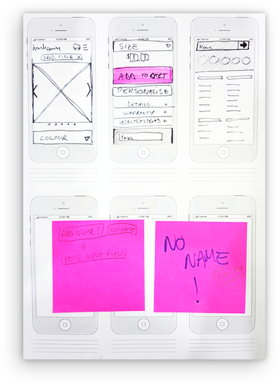
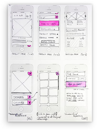
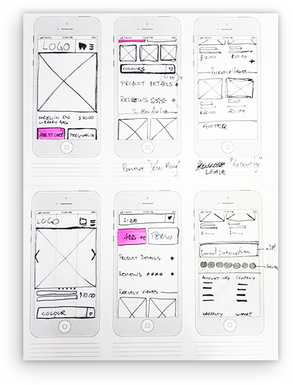
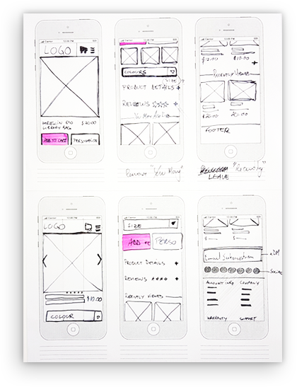
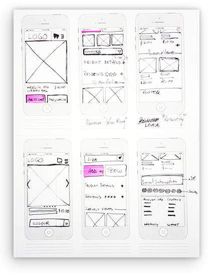
Scaling up from mobile to desktop, each level of the hierarchy was wireframed:
- Homepage;
- Category page;
- Product page;
- A "personalise your product" experience;
- Cart page;
- Checkout experience.
- Category page;
- Product page;
- A "personalise your product" experience;
- Cart page;
- Checkout experience.
Prototype
For this project I decided not to design files in Adobe or Sketch and instead of prototyping in InVision or Principle as I was used to, I decided to use Axure RP for both design and prototype.
Axure allows the use of complex variables which I used to prototype different flows, e.g. if users are signed in or not. It was also useful to prototype a realistic cart page and a checkout form that can be interacted with, accepting input.
During user testing users really felt like they are interacting with a website built on code. The prototype is still live for testing in my AxureShare account under this link.
User Testing
After prototyping it was time to recruit and set up the user testing sessions. Going back to the personas and user journeys, I documented the hypotheses to be tested and wrote a task script for the sessions.

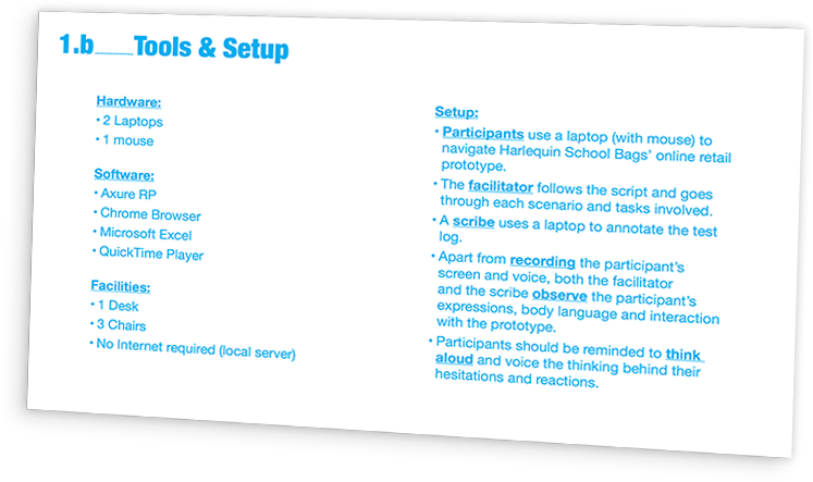
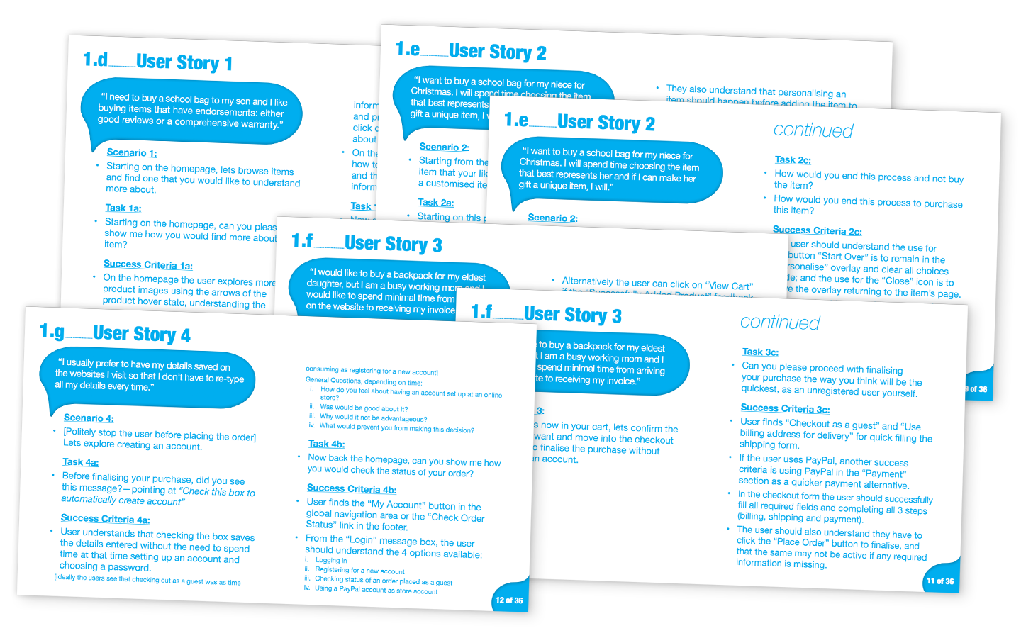
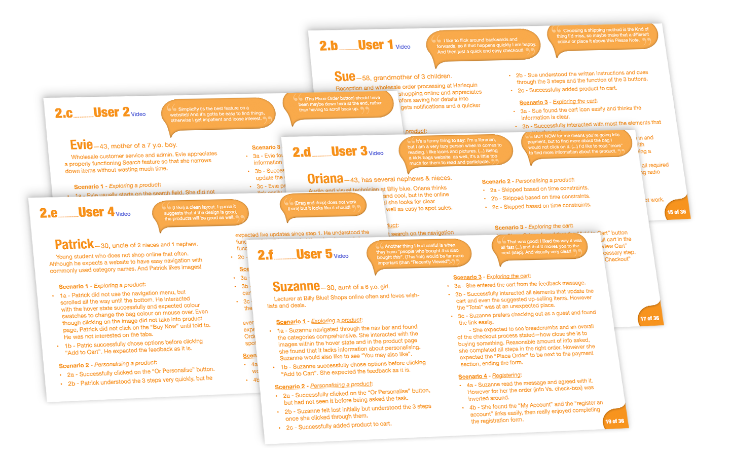
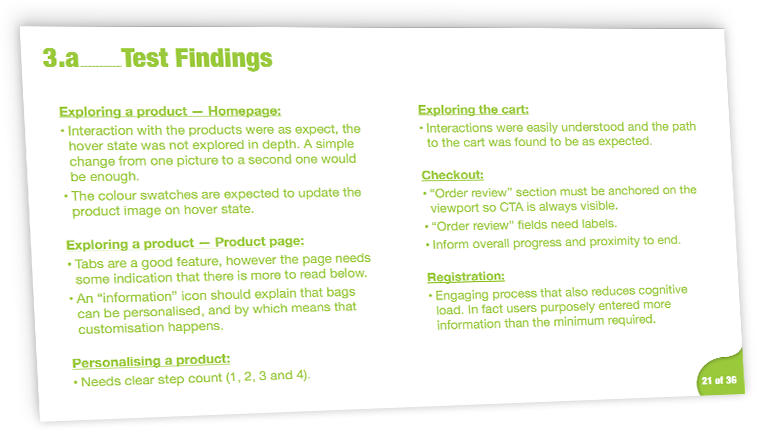
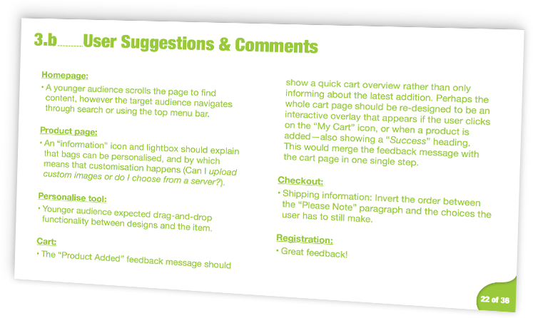
Each testing session was recorded and documented in a spreadsheet, and they can still be watched via this link. The documentation allowed me to write a report with key findings, suggestions and annotated designs to be delivered.
I also participated in the QA and debugging stage, closely monitoring the developing team offshore. In the first financial year after the re-design, schoolbags.com.au reported an organic increase of almost 30% in turnover. Visit Harlequin's retail store ;)
Would you like to discuss this project?
Thank you! I'll be in touch soon.

