Consulting project within the telecommunications sector
About the project
In the effort of improving efficiency dispatching field work orders and streamlining inventory management and payment claims this client kicked off a large project with the aim of centralising several systems and platforms into one via customising a Workforce Management vendor solution
I had two roles in different areas of this project, an initial research role and later, as the project evolved, a UI design role.
Research
in the initial phase I was asked to provide UI analysis of different application, identifying key features and pain-points. I conducted a heuristic analysis, interviewed product owners, analysed user feedback and spent time on the road with technicians conducting contextual inquiries and observations — I would have to say that the most valuable research was riding along with field work technicians out on the field.
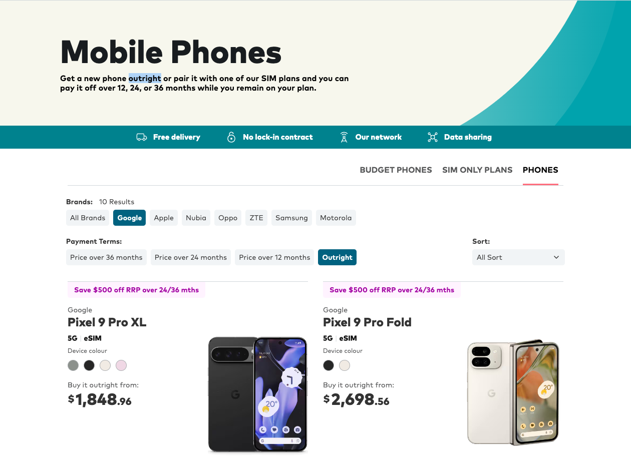
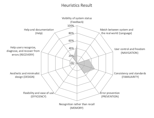
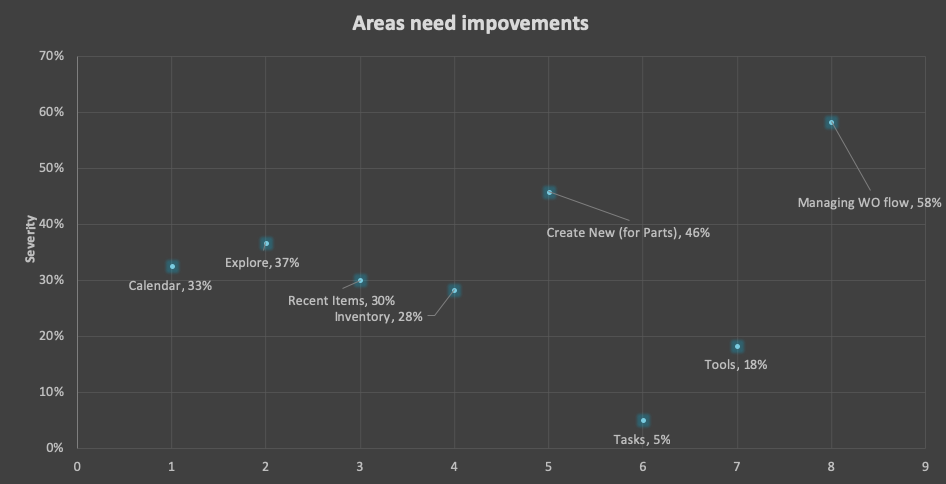
The findings were compiled into heuristics scores (for comparison with future state, see a couple of examples below), requirement user flow documentation as well as insights into the way users interact with digital products while performing activities that are so physical and dangerous.
Expansion into custom UI design
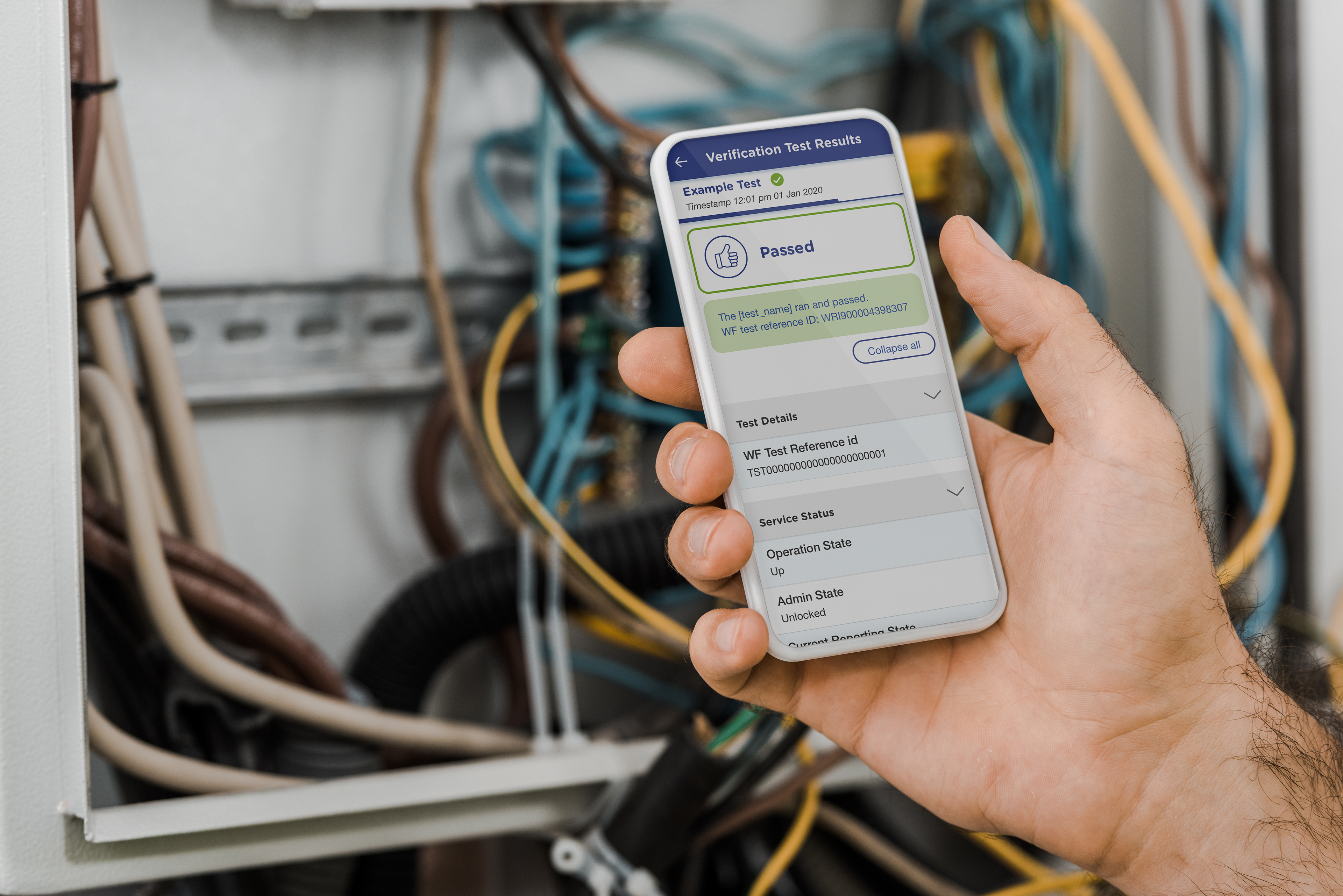
As the program matured, a business decision was made to uplift an existing application used, amongst other capabilities, to run tests on the network and "plug" it into our project's application.

Visual Language
My approach was to design a component based UI for this side web application that was scalable and easy to maintain using Material Design and React framework.
The side app opportunity quickly gained momentum and it was important to think about design governance and visual language from the beginning. Not only to ensure a seamless experience when users activated the testing suite from within the main application, but also to build a solid foundation for future enhancements.
Would you like to discuss this project?
Thank you!

