Information architecture, UX research, stakeholder management

As a HCD service provider, I prioritise the protection of my intellectual property and the corporate ownership of the projects I work on. The designs and processes showcased on this page serve solely as demonstrations of my skillset, while the ownership and rights of these designs and all capabilities described belong to Qantas. Unauthorised distribution or reproduction of the content and ideas on this page without explicit consent is prohibited.
By continuing to read you acknowledge and agree to adhere to the conditions outlined in this disclaimer.
Summary
This information architecture project for the Qantas Agency Connect portal (QAC) focused on improving content findability and reducing cognitive load for users. Through TreeTest research, issues with deep category nesting and ambiguous labelling were identified. A new IA structure with flatter hierarchy and clearer categorisation was proposed and validated through a closed card sorting study. Lastly, new category landing pages were redesigned (and tested) to be comprehensive hubs that improve navigation efficiency for users, while new content management practices were established to maintain long-term quality of page metadata.
Research
To kick off the project, a benchmarking evaluative research was conducted and documented, including a TreeTest study to assess findability of information on QAC sites. Given that QAC offered two different IA structures amongst all regions, the TreeTest ensured that two independent sets of users were each presented with one of the two IA structures available, while given the same tasks. Although the desire is to unify the QAC IA into a single structure, the job to be done was not simply choosing one to move forward with, since the study validated positives and negatives in each structure. It primarily uncovered the following issues:
- Presenting less pages clustered into a higher number of categories was consistently shown to be detrimental to the experience with both sets of users;
- More often than not, category labels and page titles were perceived as vague or ambiguous, compromising findability of information;
- Excessively clustering content by deep nesting categories into each other (”Russian Doll Effect”) over-engineers the IA structure, increasing cognitive load when interpreting category labels and when navigating up/down the structure to explore and find information.
In addition to the benchmarking TreeTest study, I documented a visual site map in Figma to illustrate the complexity of these clusters to my stakeholders. The file was set up with a birds-eye view of the IA in one page and a series of pages showing each section in more details, including how each page linked to either sibling pages or external pages. This break-down into individual pages enabled us to focus on a section to dissect its content and visual patterns, seeking to further improve the content UX and content management of the site (parallel to the IA work).
I followed this up with a high level competitor analysis exemplifying how other airlines break down their content as well as some effective labels used. I then held an internal card sorting workshop that I could use to uncover new labels, which also demonstrated to stakeholders how people operate under different mental models.
Lastly, to tackle the issue of vague page titles and poor page meta description, I used an SEO report of all live pages to highlight problematic pages and suggest new page titles and page descriptions. Using approved AI at this point to read each page then draft a meaningful summary, description and page title made this process much more streamlined, enabling me to add a final layer of human knowledge at the end to review page summaries and fine tune new titles.
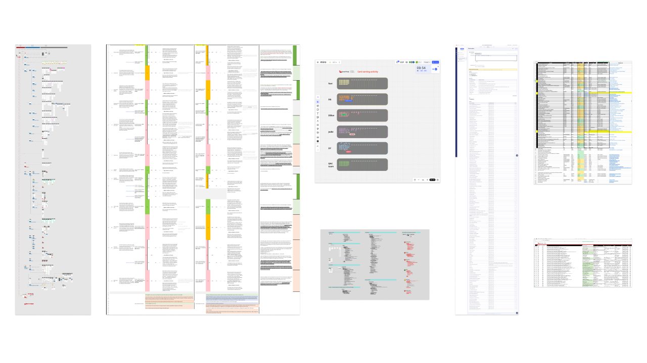
Above, some examples of artefacts delivered to document the research phase, in addition to Confluence / SharePoint pages.
Proposal
With all this research and knowledge at hand it was time to regroup pages (and their new titles) into meaningful clusters and propose a new categorisation to be validated.
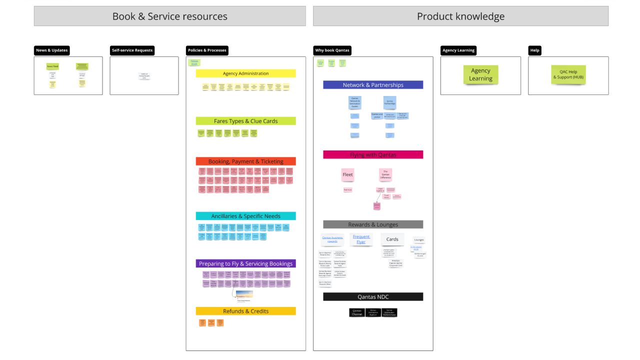
The top level navigation consisted of six items — News & Updates, Self-service requests, Policies & Procedures, Why Book Qantas (previously “products”), Agency Learning, and Help. The bulk of the re-categorisation took place within the two most complex sections, as identified by our initial research — policies and products — which were subcategorised as seen below:
POLICIES & PROCEDURES:
- Agency Administration
- Fare Types and Clue Cards
- Booking, Payment & Ticketing
- Ancillaries & Specific Needs
- Preparing to Fly & Servicing Bookings
- Refunds & Credits
- Fare Types and Clue Cards
- Booking, Payment & Ticketing
- Ancillaries & Specific Needs
- Preparing to Fly & Servicing Bookings
- Refunds & Credits
WHY BOOK QANTAS:
- Network & Partnerships
- Flying with Qantas
- Rewards & Lounges
- Qantas NDC
- Flying with Qantas
- Rewards & Lounges
- Qantas NDC
Proposal to be validated
Validation
Getting this structure in front of users was the most anticipated step. I set up a closed card sorting study and asked users to distribute 150 pages into the parent nav proposed (6 top level items) to evaluate how closely aligned with the proposal would users categorise the new page titles if presented with these 6 items as a nav menu.
The study delivered good alignment with the proposal (see image below, darker greens depict stronger alignment), with only around ⅓ of pages presenting deviation from the proposal. These deviations were further assessed taking in consideration:
- How much misalignment is present? Is it the percentage meaningful?
- Were users biased by word-association?
- Was the page title misunderstood due to lack of further context or clues (e.g. page contains policy content vs marketing/product content; page visual design resembles a policy or legal description vs a visually engaging marketing offering)?
- Were users biased by word-association?
- Was the page title misunderstood due to lack of further context or clues (e.g. page contains policy content vs marketing/product content; page visual design resembles a policy or legal description vs a visually engaging marketing offering)?
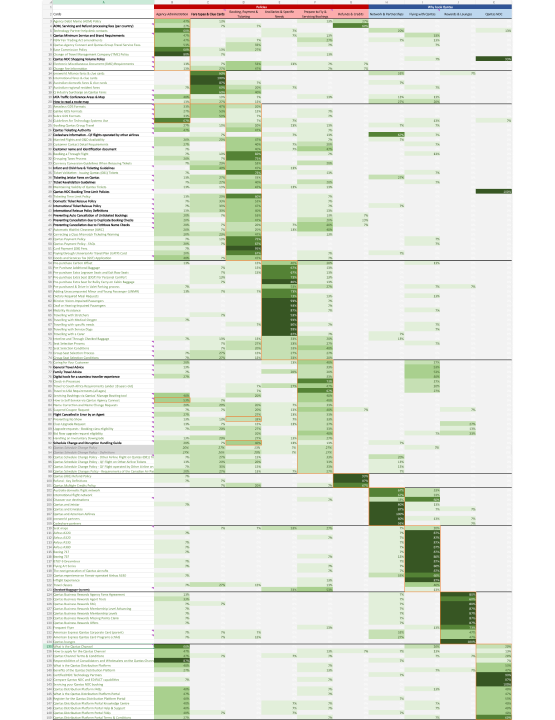
After assessing each deviation from a user’s perspective, 23 pages and 3 categories were renamed for further clarity.
Furthermore, only 7 pages were moved into a different category, but 18 pages were suggested to be “stored” in a particular category while also being referenced in another — it was advised for content producers to work with Design to find a pattern to reference pages from one category on another (like “You may also be looking for” sections in eCommerce) to enable users to cross-navigate while looking for a particular content or page.
Delivery
A) Designing to reduce cognitive load:
The new IA structure also changed the way users navigated through categories. In the previous structure (below, left) the tree was more vertical, with users clicking through multiple layers of categories or “folders” to find a page. On the other hand, the new structure (below, right) avoided nesting, presenting a flatter tree that did not require users to deep-dive through multiple folders — this eliminated the need for various category pages that were simply published as stepping stones on a path from A to B.


For this reason, the new IA required the landing pages “News & Alerts”, “Policies” and “Products” (Why Book Qantas) to be redesigned as long-scroll libraries, or “hubs”, to present content comprehensively in one page.
B) Convincing stakeholders & handling push back
When presenting the validated proposal I faced resistance from some stakeholders, primarily concerned with the impact on SEO from changes in our IA, and the amount of work anticipated by producers, which I acknowledged as valid concerns.
To instil confidence in the methodology, results and long term benefits I engaged with the SEO team to provide best-practices, support and reassurance of expected recovery times. In addition, I also committed to delivering a round of moderated user testing on the new landing pages. This would test findability of pages through tasks as well as validating that users who have a different mental model would still be able to troubleshoot and find content through the long-scroll design and supporting “you may be looking for” sections within each category on the page.
C) Adhering to the business strategy
A final amendment on the proposal was done to accommodate a strategy the product’s leadership has in place. Initially, “Qantas NDC” content was placed as a subcategory of “Products” (Why Book Qantas) for its very definition as a type of offering. Although strong alignment with users was demonstrated via closed card sorting, this content type is highly strategic and surfacing it as a top level item would not compromise the experience as it is a very self-contained type of content.
Extra benefits
Further to the usability tested landing pages, this project also delivered clearer ways-of-working practices for the digital team. Due to the poor management of page meta-data and low knowledge of UX and SEO best-practices on the business side when writing and publishing content, the digital team established a strong need for page titles and descriptions to be managed by digital stakeholders.
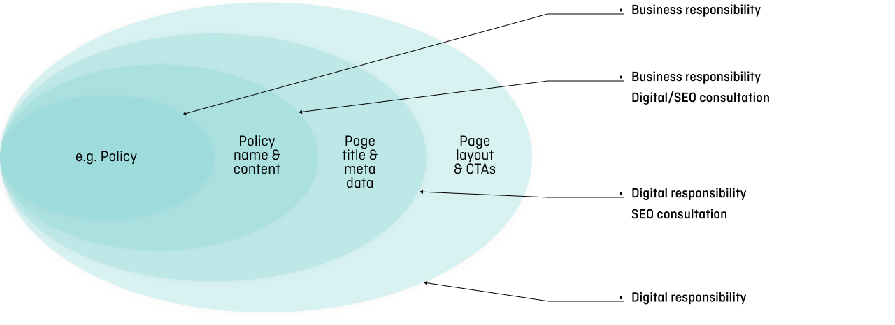
This would guarantee that the longevity of the value delivered in this project.