Subject: Wayfinding Design
Disclaimer: This is a student brief, not a commercial project. The logo 'Sculpture by the Sea" and the website depicted above are copyrights of "Sculpture by the Sea Incorporated" and have not been reproduced here with any commercial intent. All signage collateral and digital assets, including the app concept and design, are my intellectual property and were developed for the purpose of delivering a response to a university brief. They may not be reproduced without my expressed consent.
About the project
I frequently challenged myself during my academic journey to take on subjects that were not part of the Digital Media program, but that could potentially offer me the opportunity to deliver a digital solution to their brief. Wayfinding Design was one of them.
The brief was to re-design a wayfinding solution for a public space (e.g. Railway station, bike paths, medical centre, art gallery, library, park etc), after researching the pain-points in the existing solution. Deliverables included a report on best practices in wayfinding design, an analysis of the existing wayfinding in the chosen space, design of all signage and final delivery report including demographics, user journeys and mock-up applications of digital signage in context.
An augmented reality signage solution for Sculpture by the Sea was my topic of choice, however being a Communication Design subject (mostly print based), the lecturer did not authorise me to deliver only a digital solution—both a physical and a digital journey must be present in my delivery, with clear demonstration of cross-over points in the journey.
From a user's perspective, wayfinding is about improving their journey from one point to another, or in other words their experience through space. This concept strongly ties in with digital UX and delivering a multi-channel solution forced me to have a wholistic approach to my project, thinking beyond the App experience. It became a CX project.
Research
All projects start with research, and this one required not only a look at the exhibition as a brand as well as the physical journey taken by users during their visits, but it also required an understanding of a broader journey taken by the user in before and after visitation.
I visited the path the exhibition occupies before and during the exhibition to observe pain-points with both the permanent and temporary signage and took dozens of pictures.
I also analysed the current state of digital wayfinding and challenged its status quo. Screens indeed can offer a cost-effective solution with regards to Orientation, Route Decision and Destination Recognition, however, even the more advanced interactive screens that deliver contextual experiences still do not offer an acceptable solution to a crucial part of a user's navigation—Route Monitoring.
So I researched emerging concepts in digital wayfinding design and came across indoors mapping, augmented reality solutions and image database through machine learning. These were going to be my inspiration.
Problems
Starting from the identified pain-points and exploring "how might we...?" statements helped me define the problem. A small issue was that that users were forced to follow a linear journey from beginning to end, not receiving enough information when they started their journey from a 'fork in the middle of the path'. This issue is particularly harmful to visitors who are not locals or are unfamiliar with the area.
In addition, a more severe issue was that unless the user purchased a catalogue, no information about the pieces being exhibited is offered to visitors, which is an important part of wayfinding for art galleries.
I was asked at one point by the lecturer "Why do you want to make it digital?", and after looking back at the pictures from my visit to the exhibition I had my response—it already is. Everyone already uses their phones to capture and experience the exhibition:
Digital Concept
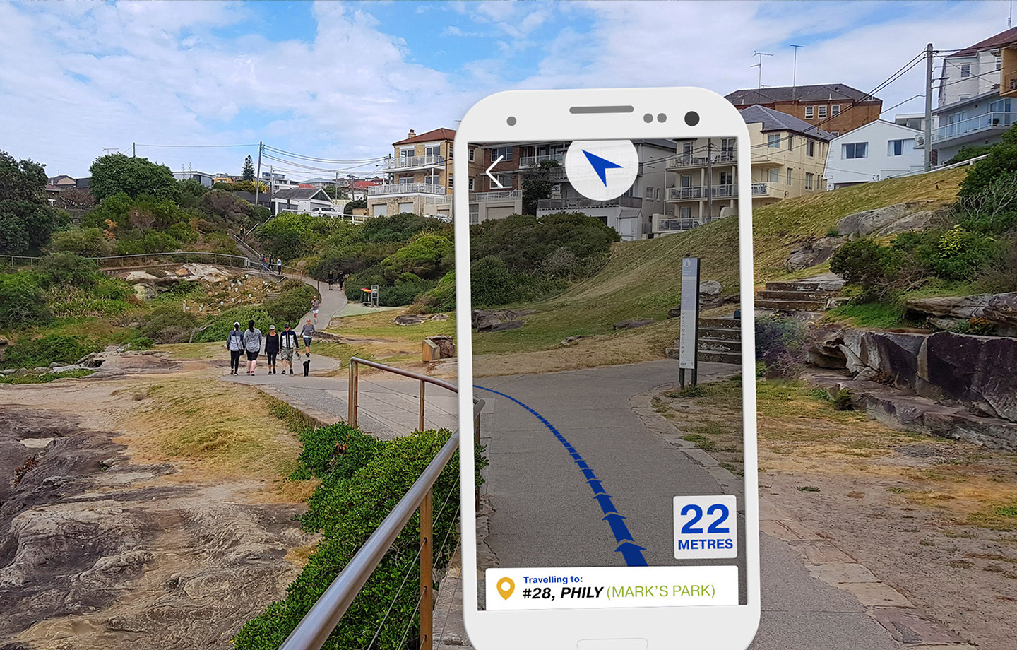
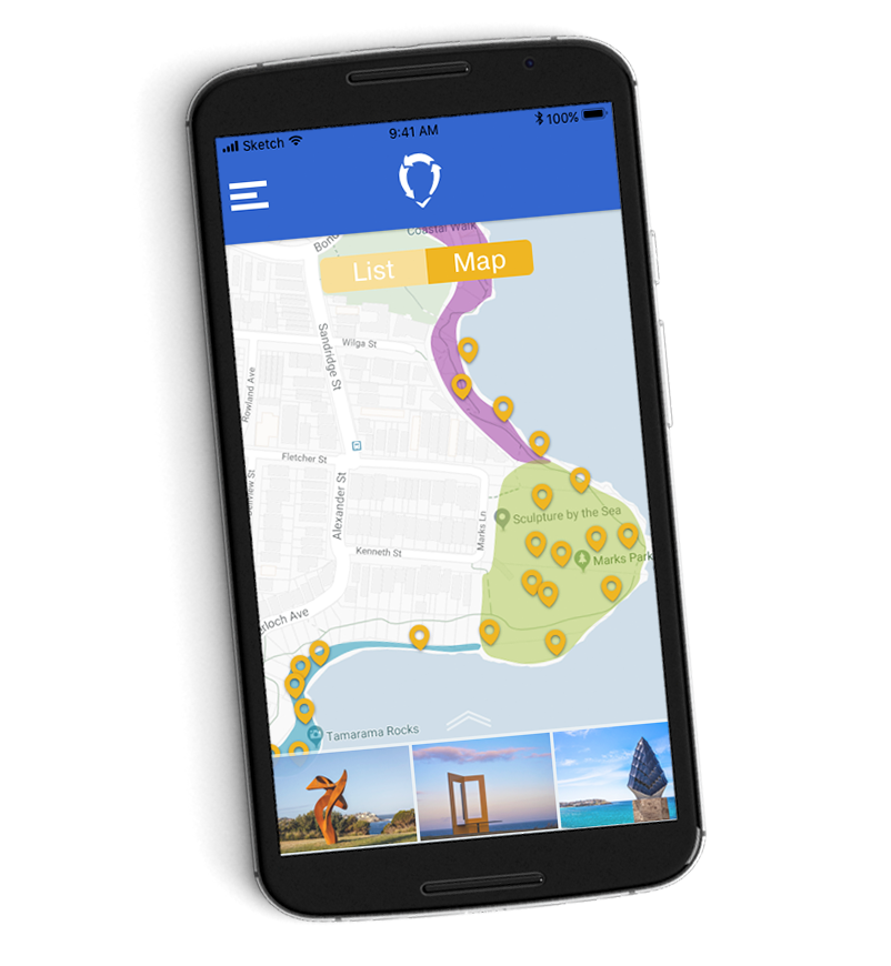
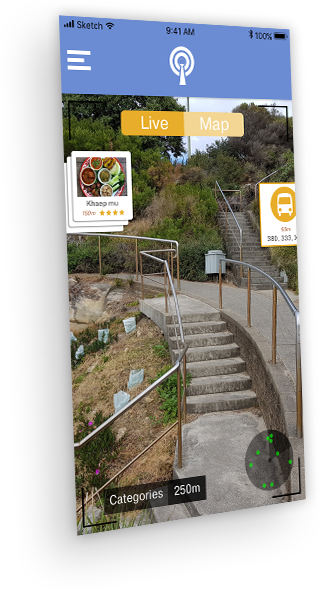
The concept is a smartphone app that offers a catalogue of information about each piece exhibited. It also offers on screen navigation from the current location to a desired artwork, facility or local points of interest.
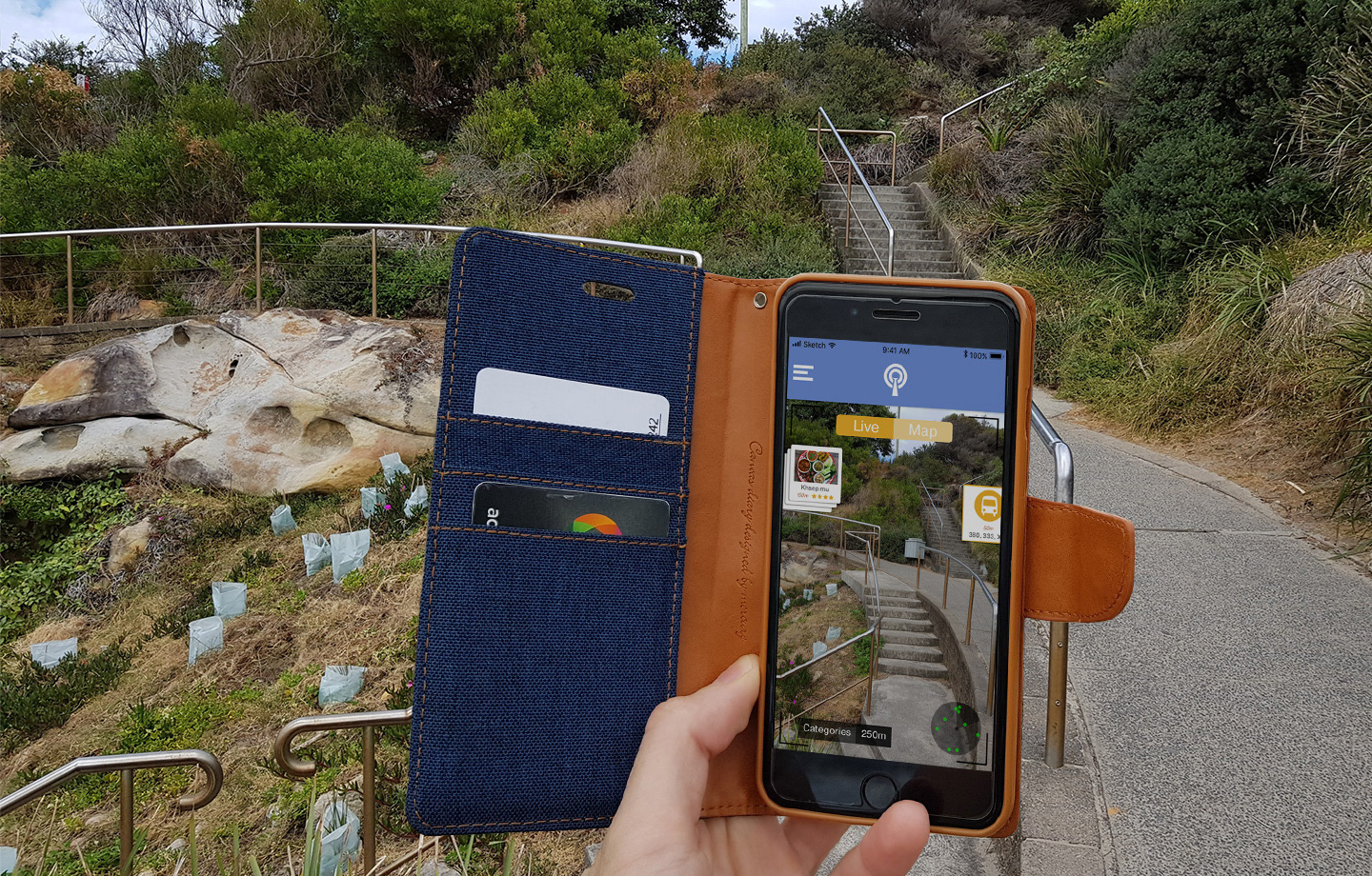
A delightful capability to encourage users to use the app would be an augmented reality function available when pointing the camera at certain artworks. Users could take and share pictures online or even send them to a merchandise shop for printing, for example.
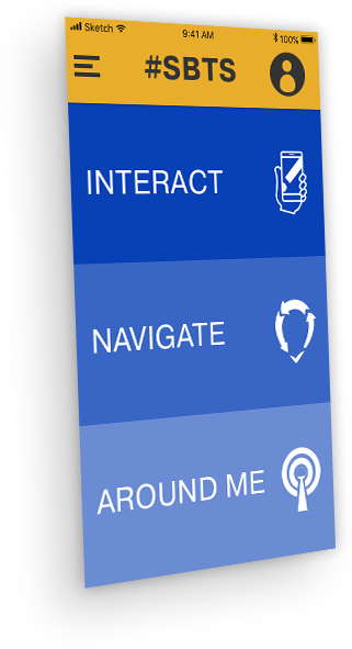
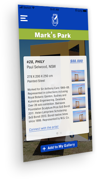
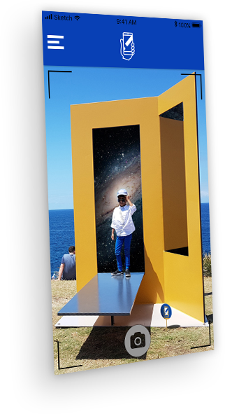
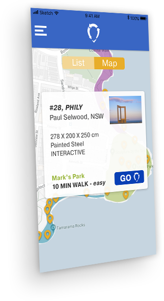
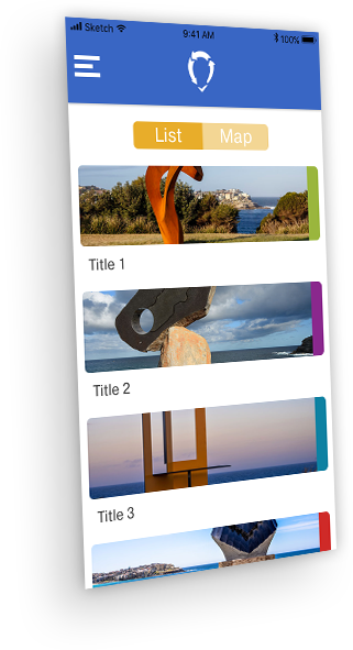
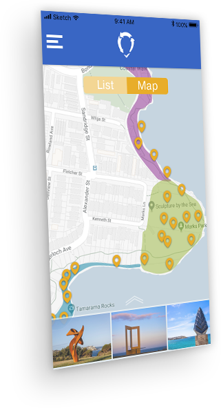
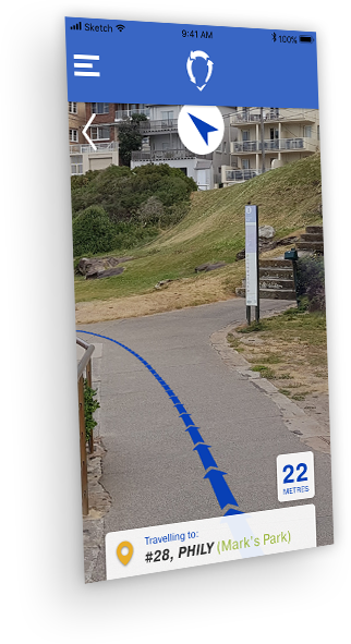
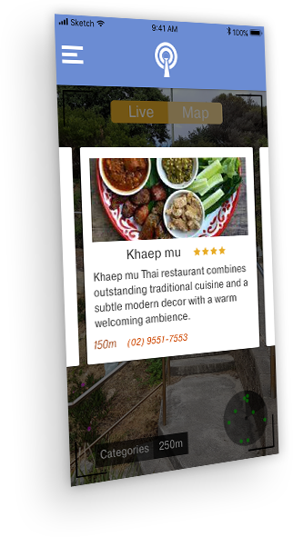

Signage Design
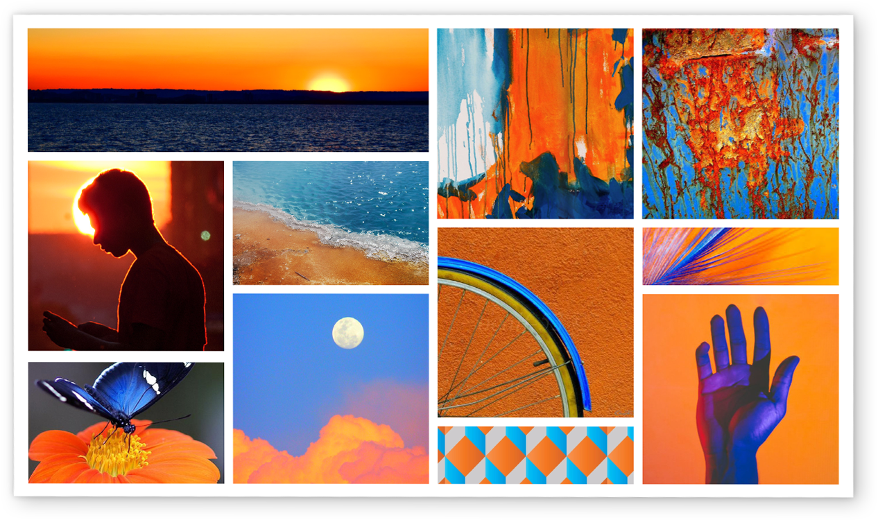
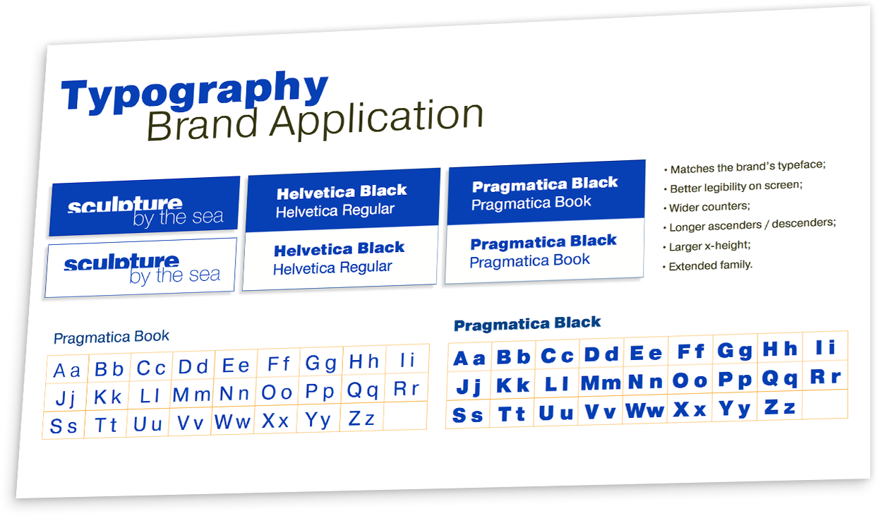
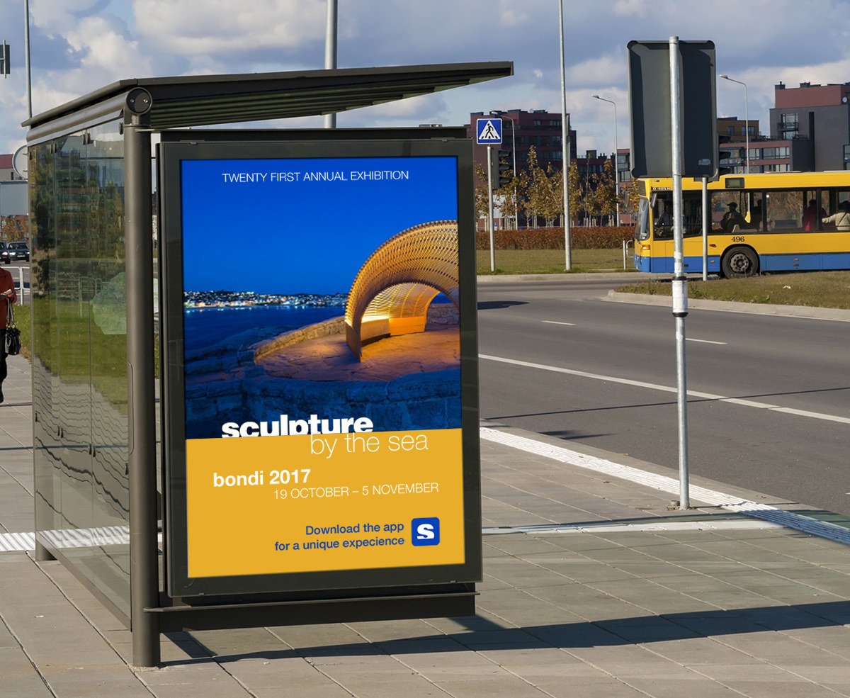
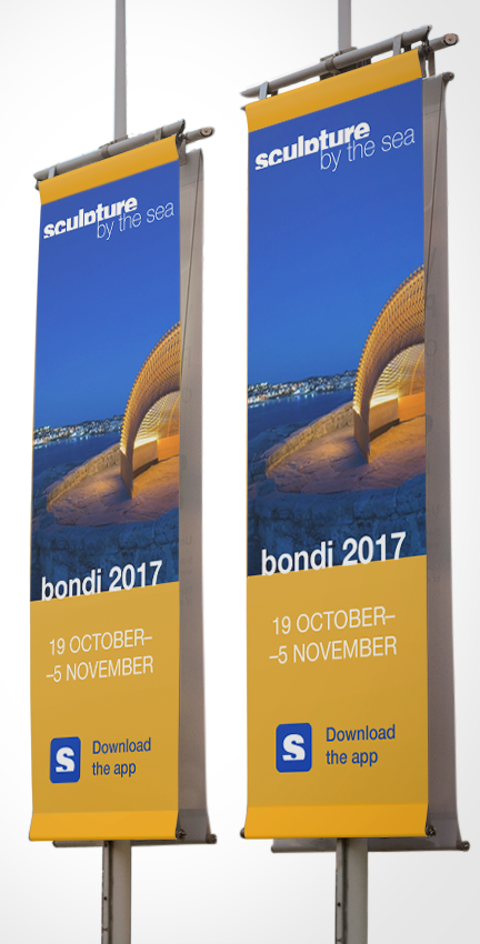
The exhibition uses a complimentary colour palette following a 1:3 ratio. These colours and ratio were replicated in all printed and digital signage I proposed.
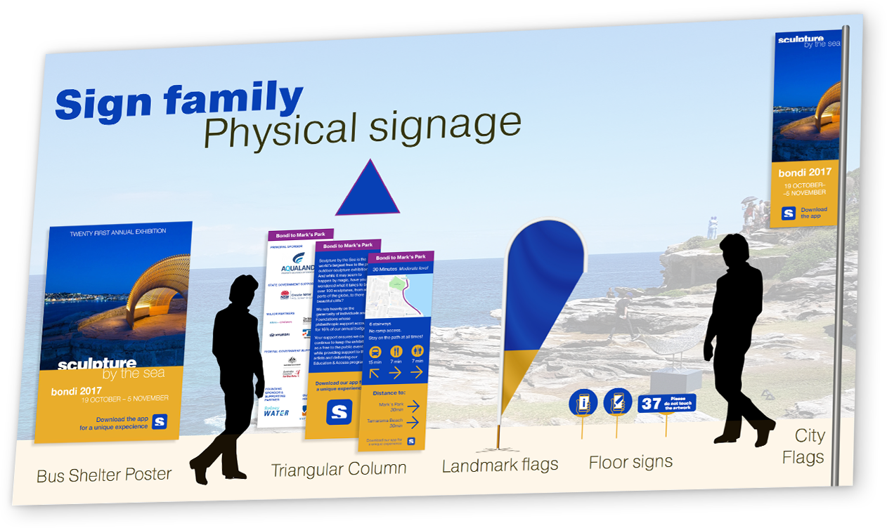
From them I chose four supporting colours to be used to colour-code four areas within the exhibition: from Bondi beach to Marks Park; Marks Park area; from Marks Park to Tamarama beach; and Tamarama beach area. These supporting colours will be featured in signage in all stages of journey mapping: orientation, route decision, route monitoring and destination recognition.


Experiences
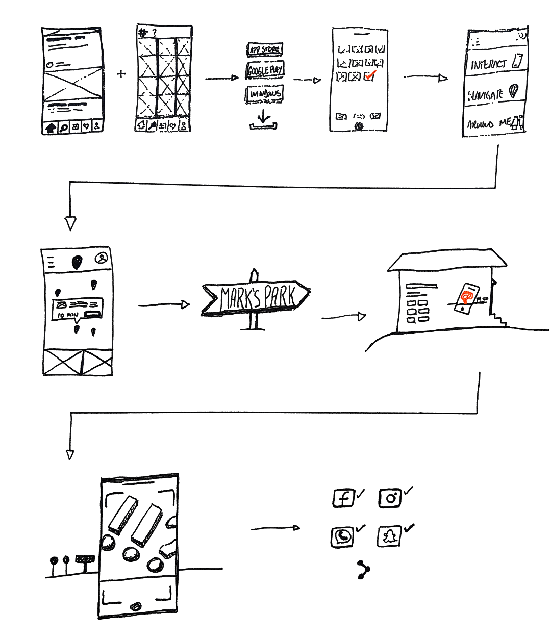
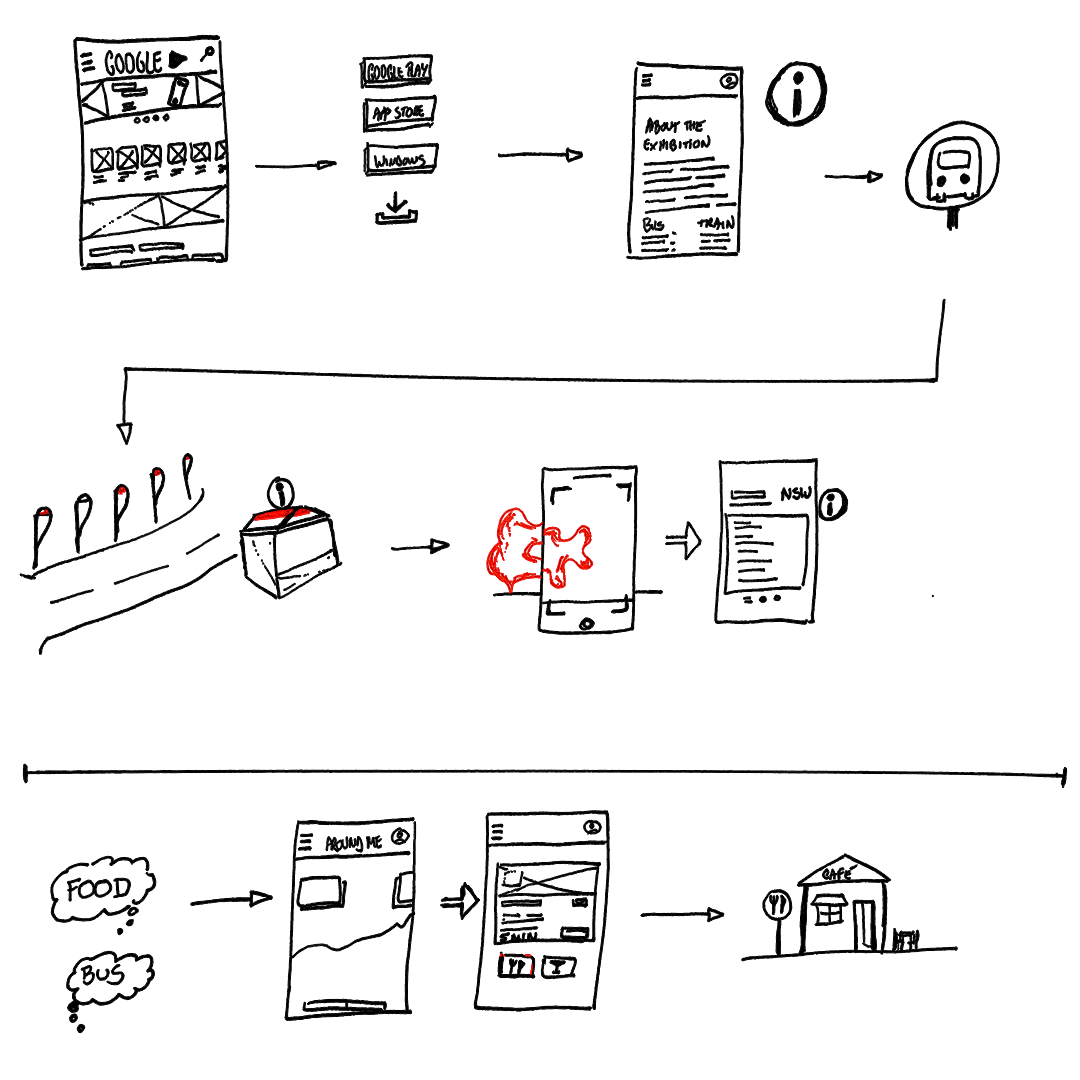
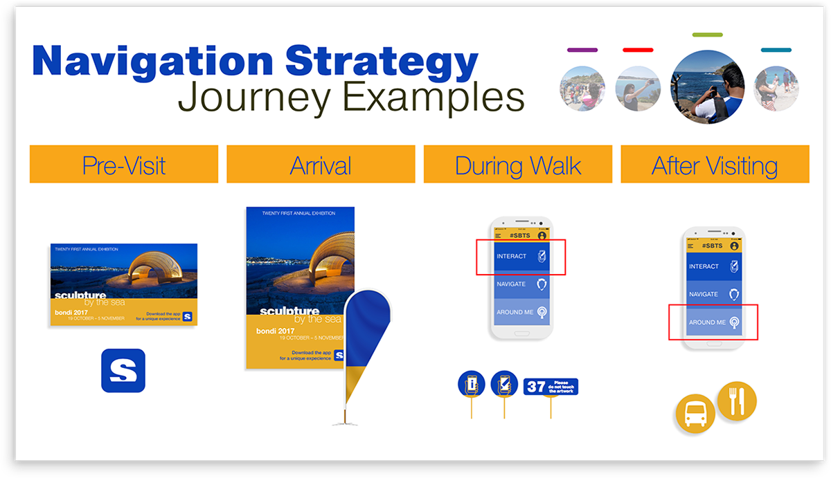
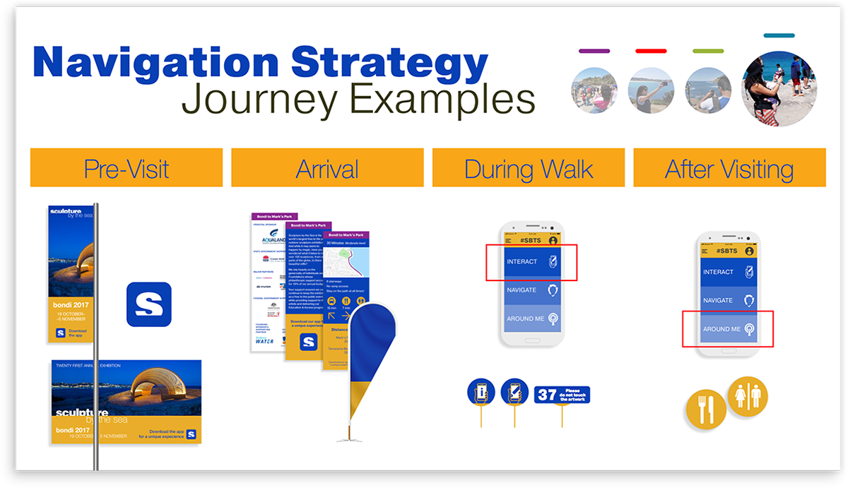
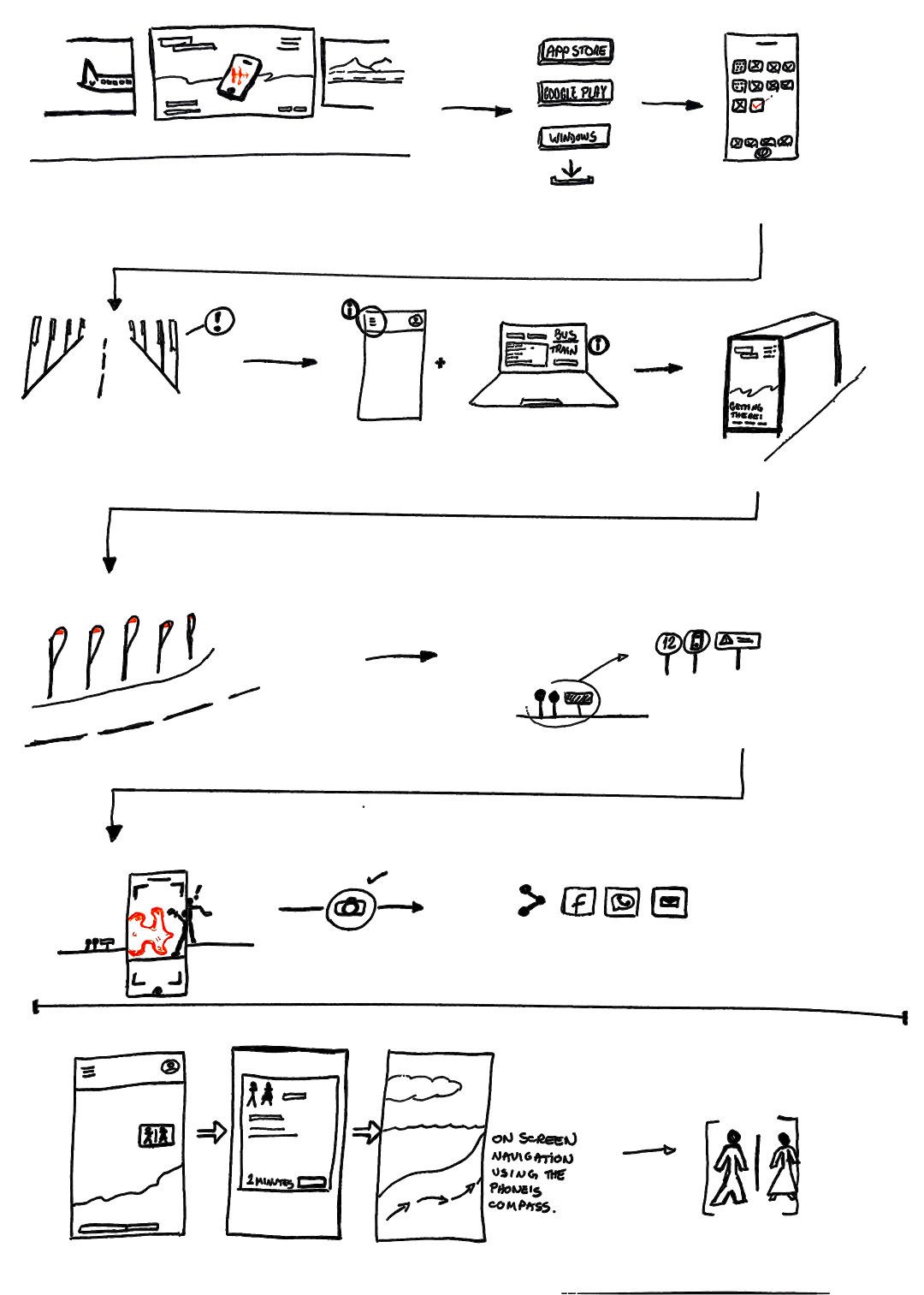
Lastly, to design a multi-channel customer experience I created four personas and sketched their journeys. I applied the app concept and the physical signage placement to these journeys, creating flows that exemplify how visitors move from digital to physical mediums and vice versa in their experience.


Would you like to discuss this project?
Thank you!
